2013 Portfolio Bram de Vogel
40
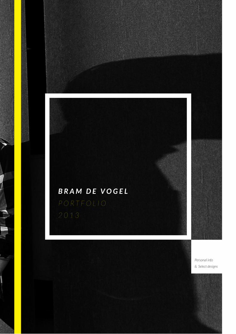
+++++++++++++++++++++++++ Personal info & Select designs BRAM DE VOGEL PORTFOLIO 2013
-
Upload
bram-de-vogel -
Category
Documents
-
view
228 -
download
4
description
2013 Portfolio of Bram de Vogel, 2nd year student Industrial Design.
Transcript of 2013 Portfolio Bram de Vogel
Page 1
T H I S
I S
T H E P O R T F O L I O
o f B R A M D E V O G E L
B R A M D E V O G E L
P O R T F O L I O
+ + + + + + + + + + + + + + + + + + + + + + + + ++ + + + + + + + + + + + + + + + + + + + + + + + ++ + + + + + + + + + + + + + + + + + + + + + + + ++ + + + + + + + + + + + + + + + + + + + + + + + ++ + + + + + + + + + + + + + + + + + + + + + + + ++ + + + + + + + + + + + + + + + + + + + + + + + ++ + + + + + + + + + + + + + + + + + + + + + + + ++ + + + + + + + + + + + + + + + + + + + + + + + ++ + + + + + + + + + + + + + + + + + + + + + + + ++ + + + + + + + + + + + + + + + + + + + + + + + ++ + + + + + + + + + + + + + + + + + + + + + + + ++ + + + + + + + + + + + + + + + + + + + + + + + ++ + + + + + + + + + + + + + + + + + + + + + + + ++ + + + + + + + + + + + + + + + + + + + + + + + ++ + + + + + + + + + + + + + + + + + + + + + + + ++ + + + + + + + + + + + + + + + + + + + + + + + ++ + + + + + + + + + + + + + + + + + + + + + + + ++ + + + + + + + + + + + + + + + + + + + + + + + ++ + + + + + + + + + + + + + + + + + + + + + + + ++ + + + + + + + + + + + + + + + + + + + + + + + ++ + + + + + + + + + + + + + + + + + + + + + + + ++ + + + + + + + + + + + + + + + + + + + + + + + ++ + + + + + + + + + + + + + + + + + + + + + + + ++ + + + + + + + + + + + + + + + + + + + + + + + ++ + + + + + + + + + + + + + + + + + + + + + + + ++ + + + + + + + + + + + + + + + + + + + + + + + ++ + + + + + + + + + + + + + + + + + + + + + + + ++ + + + + + + + + + + + + + + + + + + + + + + + ++ + + + + + + + + + + + + + + + + + + + + + + + ++ + + + + + + + + + + + + + + + + + + + + + + + ++ + + + + + + + + + + + + + + + + + + + + + + + ++ + + + + + + + + + + + + + + + + + + + + + + + ++ + + + + + + + + + + + + + + + + + + + + + + + ++ + + + + + + + + + + + + + + + + + + + + + + + +
T H I S
I S
T H E P O R T F O L I O
o f B R A M D E V O G E L
P RT F L I O
Personal info
& Select designs
B R A M D E V O G E L
P O R T F O L I O
2 0 1 3
Page 2
H E L L O , M Y N A M E I S . . H E L L O , M Y N A M E I S . . H E L-L O , M Y N A M E I S . . H E L L O , M Y N A M E I S . . H E L L O , M Y N A M E I S . . H E L-L O , M Y N A M E I S . . H E L L O , M Y N A M E I S . . H E L L O , M Y N A M E I S . . H E L-L O , M Y N A M E I S . .
Page 3
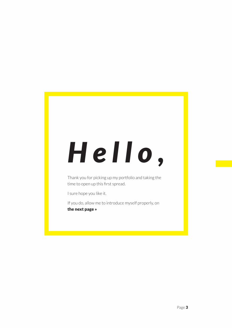
Thank you for picking up my portfolio and taking the
time to open up this first spread.
I sure hope you like it.
If you do, allow me to introduce myself properly, on
the next page »
H e l l o ,
Page 4
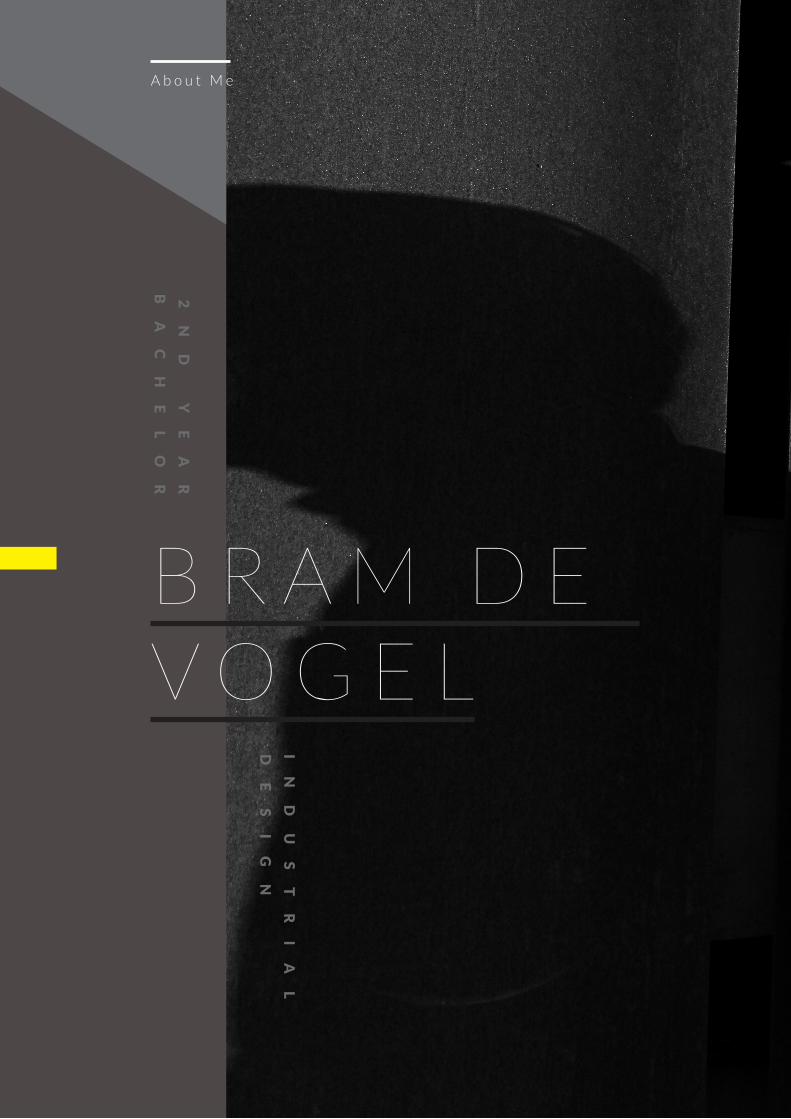
B R A M D E V O G E L
A b o u t M e
2
ND
Y
EA
R
BA
CH
EL
OR
IN
DU
ST
RI
AL
DE
SI
GN
Page 5Page 5
Page 6
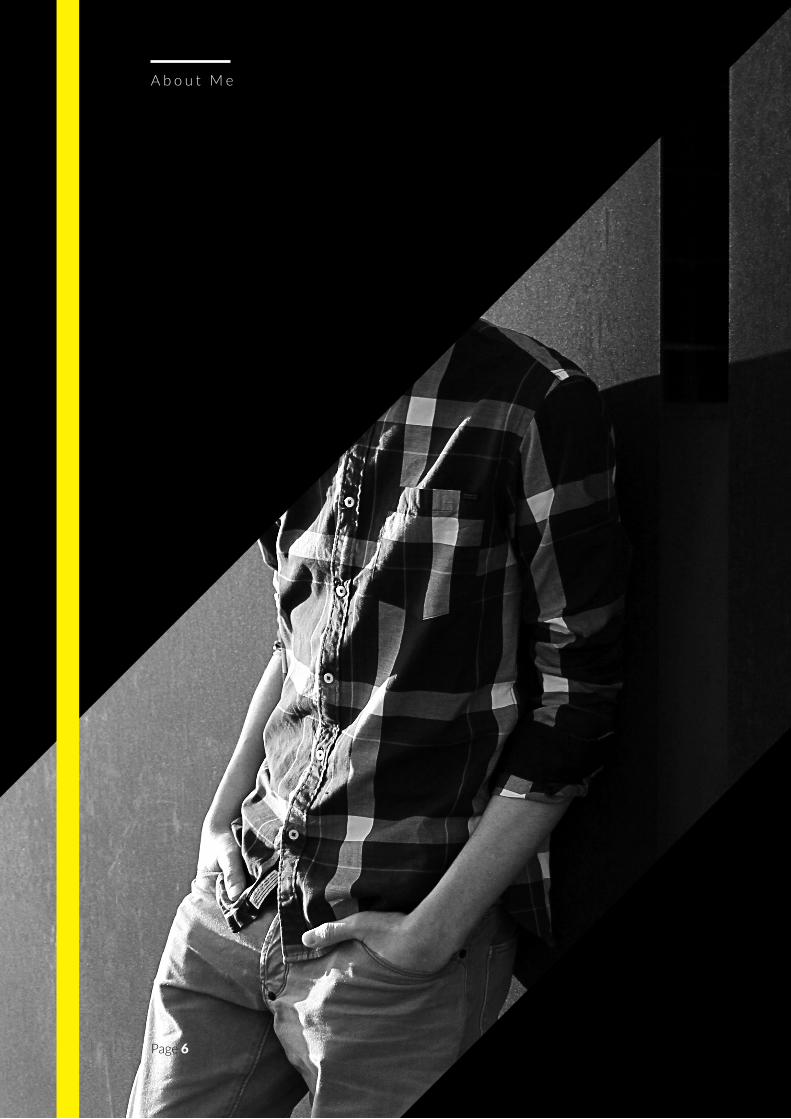
A b o u t M e
Page 6
Page 7
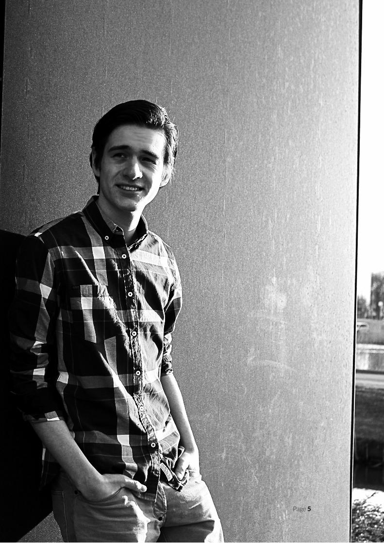
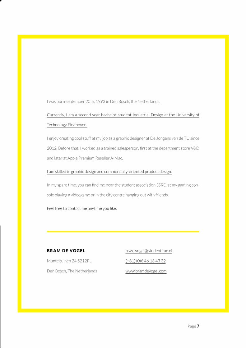
I was born september 20th, 1993 in Den Bosch, the Netherlands.
Currently, I am a second year bachelor student Industrial Design at the University of
Technology Eindhoven.
I enjoy creating cool stuff at my job as a graphic designer at De Jongens van de TU since
2012. Before that, I worked as a trained salesperson, first at the department store V&D
and later at Apple Premium Reseller A-Mac.
I am skilled in graphic design and commercially-oriented product design.
In my spare time, you can find me near the student association SSRE, at my gaming con-
sole playing a videogame or in the city centre hanging out with friends.
Feel free to contact me anytime you like.
B R A M D E VO G E L
Munteltuinen 24 5212PL
Den Bosch, The Netherlands
(+31) (0)6 46 13 43 32
www.bramdevogel.com
Page 8
V I S I O N
A b o u t M e
Page 9
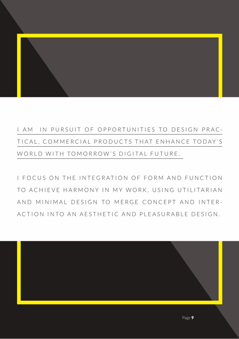
I A M I N P U R S U I T O F O P P O R T U N I T I E S T O D E S I G N P R A C -
T I C A L , C O M M E R C I A L P R O D U C T S T H A T E N H A N C E T O D A Y ’ S
W O R L D W I T H T O M O R R O W ’ S D I G I T A L F U T U R E .
I F O C U S O N T H E I N T E G R A T I O N O F F O R M A N D F U N C T I O N
T O A C H I E V E H A R M O N Y I N M Y W O R K , U S I N G U T I L I T A R I A N
A N D M I N I M A L D E S I G N T O M E R G E C O N C E P T A N D I N T E R -
A C T I O N I N T O A N A E S T H E T I C A N D P L E A S U R A B L E D E S I G N .
Page 9
Page 10
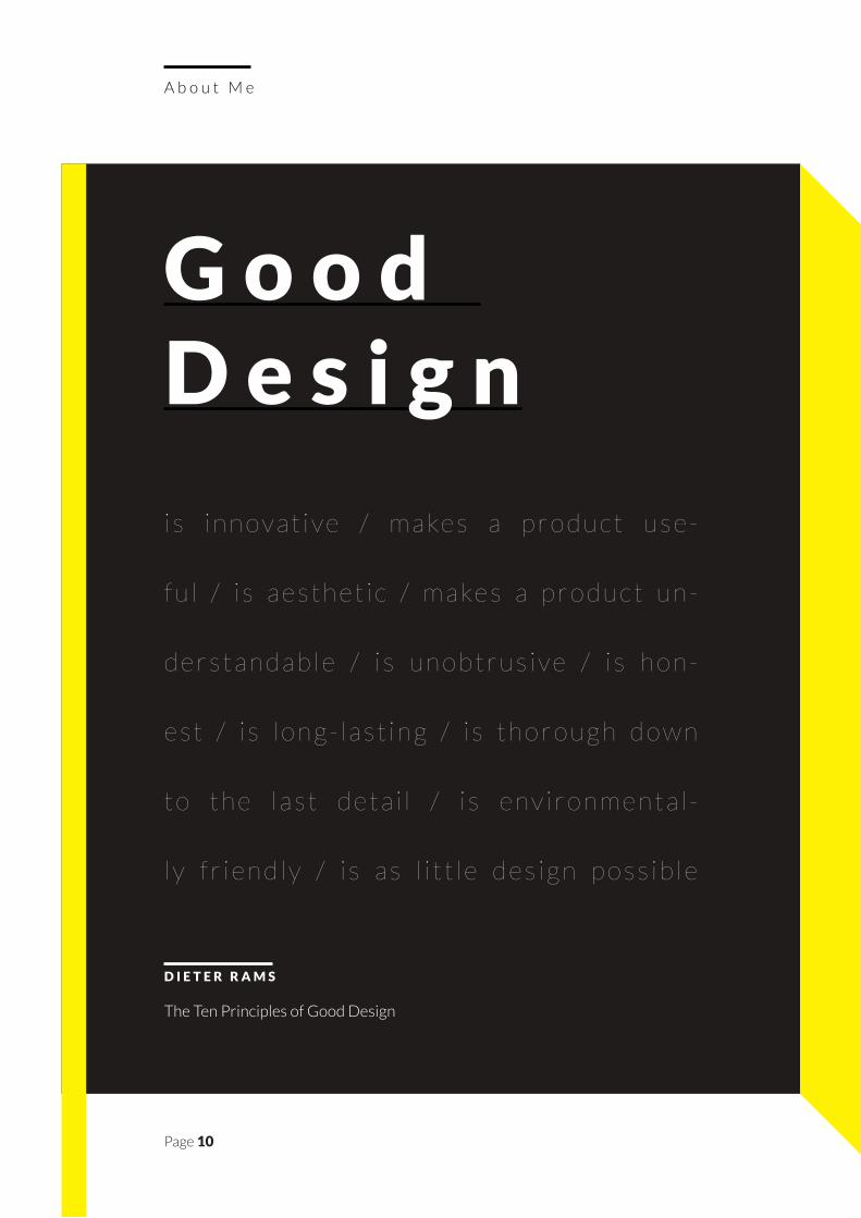
i s i n n ov a t i ve / m a ke s a p r o d u c t u s e -
f u l / i s a e s t h e t i c / m a ke s a p r o d u c t u n -
d e r s t a n d a b l e / i s u n o b t r u s i ve / i s h o n -
e s t / i s l o n g - l a s t i n g / i s t h o r o u g h d o w n
t o t h e l a s t d e t a i l / i s e nv i r o n m e n t a l -
l y f r i e n d l y / i s a s l i t t l e d e s i g n p o s s i b l e
A b o u t M e
G o o d D e s i g n
D I E T E R R A M S
The Ten Principles of Good Design
Page 11
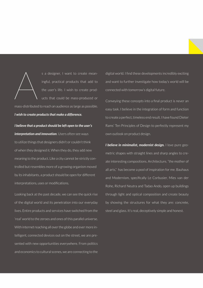
As a designer, I want to create mean-
ingful, practical products that add to
the user’s life. I wish to create prod-
ucts that could be mass-produced or
mass-distributed to reach an audience as large as possible.
I wish to create products that make a difference.
I believe that a product should be left open to the user’s
interpretation and innovation. Users often see ways
to utilize things that designers didn’t or couldn’t think
of when they designed it. When they do, they add new
meaning to the product. Like a city cannot be strictly con-
trolled but resembles more of a growing organism moved
by its inhabitants, a product should be open for different
interpretations, uses or modifications.
Looking back at the past decade, we can see the quick rise
of the digital world and its penetration into our everyday
lives. Entire products and services have switched from the
‘real’ world to the zeroes and ones of this parallel universe.
With internet reaching all over the globe and ever more in-
telligent, connected devices out on the street, we are pre-
sented with new opportunities everywhere. From politics
and economics to cultural scenes, we are connecting to the
digital world. I find these developments incredibly exciting
and want to further investigate how today’s world will be
connected with tomorrow’s digital future.
Conveying these concepts into a final product is never an
easy task. I believe in the integration of form and function
to create a perfect, timeless end result. I have found Dieter
Rams’ Ten Principles of Design to perfectly represent my
own outlook on product design.
I believe in minimalist, modernist design. I love pure geo-
metric shapes with straight lines and sharp angles to cre-
ate interesting compositions. Architecture, “the mother of
all arts,” has become a pool of inspiration for me. Bauhaus
and Modernism, specifically Le Corbusier, Mies van der
Rohe, Richard Neutra and Tadao Ando, open up buildings
through light and optical composition and create beauty
by showing the structures for what they are: concrete,
steel and glass. It’s real, deceptively simple and honest.
Page 12
S e l e c t e d W o r k
Page 13
S E L E C T E D
W O R K
Page 13
Page 14
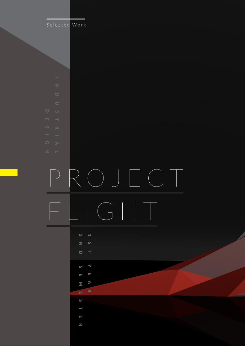
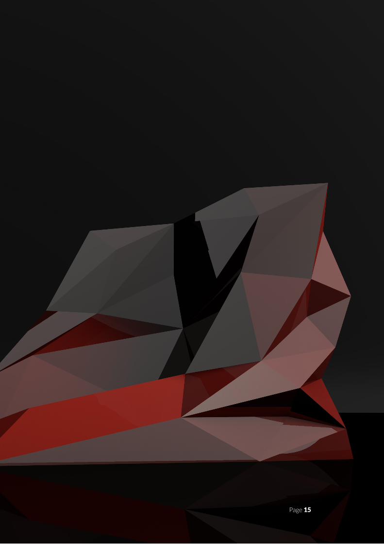
P R O J E C T
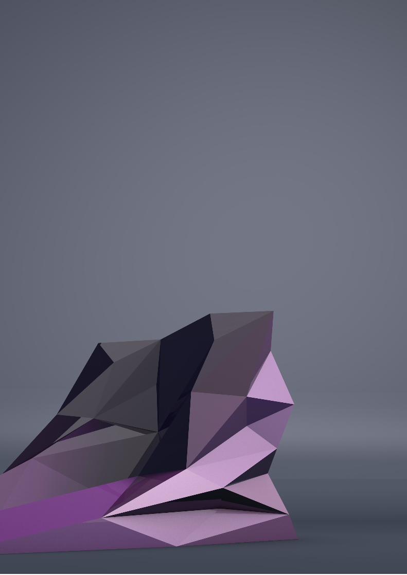
F L I G H T
S e l e c t e d W o r k
I
ND
US
TR
IA
L
DE
SI
GN
1S
T
YE
AR
2N
D
SE
ME
ST
ER
Page 15Page 15
Page 16
S e l e c t e d W o r k
C l i e n tUniversity of Technology Eind-hoven, Municipality of Eind-hoven, Brainport Eindhoven
Ye a r2012
Ty p eIndustrial Design
Wo r k B1.2 Semester Group Project
Page 17
P R O J E C T B R I E F
F L I G H T I S A F A S T , P R O F E S S I O N A L C O M M U N I C A T I O N I N T E R -
F A C E S T I M U L A T I N G C O L L A B O R A T I O N I N T H E Y E A R 2 0 2 0 .
In today’s cities, having easy access
to other people and to facilities
no longer requires their physical
vicinity as in the traditional cities.
Instead, people and services are “one but-
ton away”, creating the notion of digital
cities.
The project focuses on places where
people can go and meet people who are
physically in other locations. The target
group is the Facebook generation, more
specifically representatives of the cre-
ative industry (new age entrepreneurs),
for whom sharing knowledge and coop-
eration are no longer linked to a physical
location.
The overall goal is to design an ‘Internet
Cafe 2020’: a place where groups of new
age entrepreneurs can meet with similar
groups elsewhere for sharing knowledge
and cooperation, learning from each oth-
Page 17
Page 18
Inspired by the rise of flexible
working and the complete inte-
gration of (digital) technology
and data in our lives, FLIGHT
aims to develop more relevant commu-
nication and stimulate collaboration be-
tween professionals.
Currently, there is a lot of superfluous
information we process each day. This
continuing dataflow through social net-
works, mailing lists and group chats of-
ten contains less value to the average
working individual. Especially for flexi-
ble professionals, such as creatives and
consultants, time is money; whenever
they spend time processing non-relevant
information, they lose money. This also
means that those bits that truly matter
may get lost in the vast amount of less
important data. In an age where the data
output is increasing exponentially, the
key has become to make sense of it all.
FLIGHT aims to make relevant the com-
munication and circulating information
within a working environment. The user
only receives data, requests and updates
that may be of use to him, increasing the
likelihood that it will add value to his work
or that a new, succesful collaboration
may begin.
In an age where services, products and
communications are shifting towards the
internet, connecting to other people and
companies is easier than ever. However,
we may ask ourselves if we feel we are
still interacting with other human beings,
or merely entering binary code into dig-
ital access points. It may be time for an
increase in physical interaction within a
digital world.
Interaction is fast and uses natural hand
gestures on the device, to increase speed
and efficiency and decrease the time
needed to manage incoming communica-
tions.
F L I G H T
C O N C E P T D E S C R I P T I O N
Page 18
Page 19
Page 20
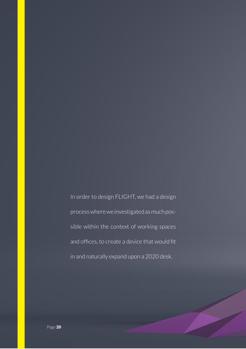
In order to design FLIGHT, we had a design
process where we investigated as much pos-
sible within the context of working spaces
and offices, to create a device that would fit
in and naturally expand upon a 2020 desk.
Page 20
Page 21
Page 22
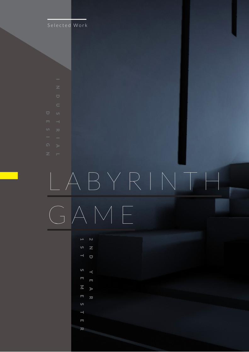
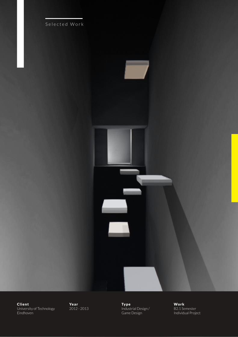
L A B Y R I N T H
G A M E
S e l e c t e d W o r k
I
ND
US
TR
IA
L
DE
SI
GN
2N
D
YE
AR
1S
T
SE
ME
ST
ER
Page 23Page 23
Page 24
S e l e c t e d W o r k
C l i e n tUniversity of Technology Eindhoven
Ye a r2012 - 2013
Ty p eIndustrial Design / Game Design
Wo r k B2.1 Semester Individual Project
Page 25
P R O J E C T B R I E F
L A B Y R I N T H I S A F I R S T - P E R S O N P C G A M E W I T H A F O -
C U S O N E X P L O R A T I O N A N D P L A T F O R M I N G . I T A I D S T H E
P L A Y E R I N B R E A K I N G A D E P R E S S I V E T H I N K I N G P A T -
T E R N C O M M O N L Y A S S O C I A T E D W I T H ( M I L D ) D E P R E S S I O N S .
Digital games have the potential to offer
us interesting what-if scenarios. Within
the safe confines of the fantasy world we
can enact different roles and try out dif-
ferent actions to attain a goal. As the play-
er identifies with the avatar and inter-
nalizes his or her motivations, the game
becomes conducive to instill attitudinal
change. Here, we tried to use this poten-
tially beneficial characteristic of games to
engender positive emancipation.
In this project you will have to design and
create a computer game that helps a play-
er cope with societal or peer pressures.
The idea is to improve a player’s feeling
of self-worth, so that a person from an
underprivileged group playing your game
will subsequently have the confidence to
do a certain task in real life or be an active
member of society. Think, for instance, of
a game to help teenagers cope with bul-
lying, addicts with their addiction, homo-
sexual people to be who they really are, or
underachieving students to gain the con-
fidence that studying hard will help them
to attain a diploma.
Page 25
Page 26
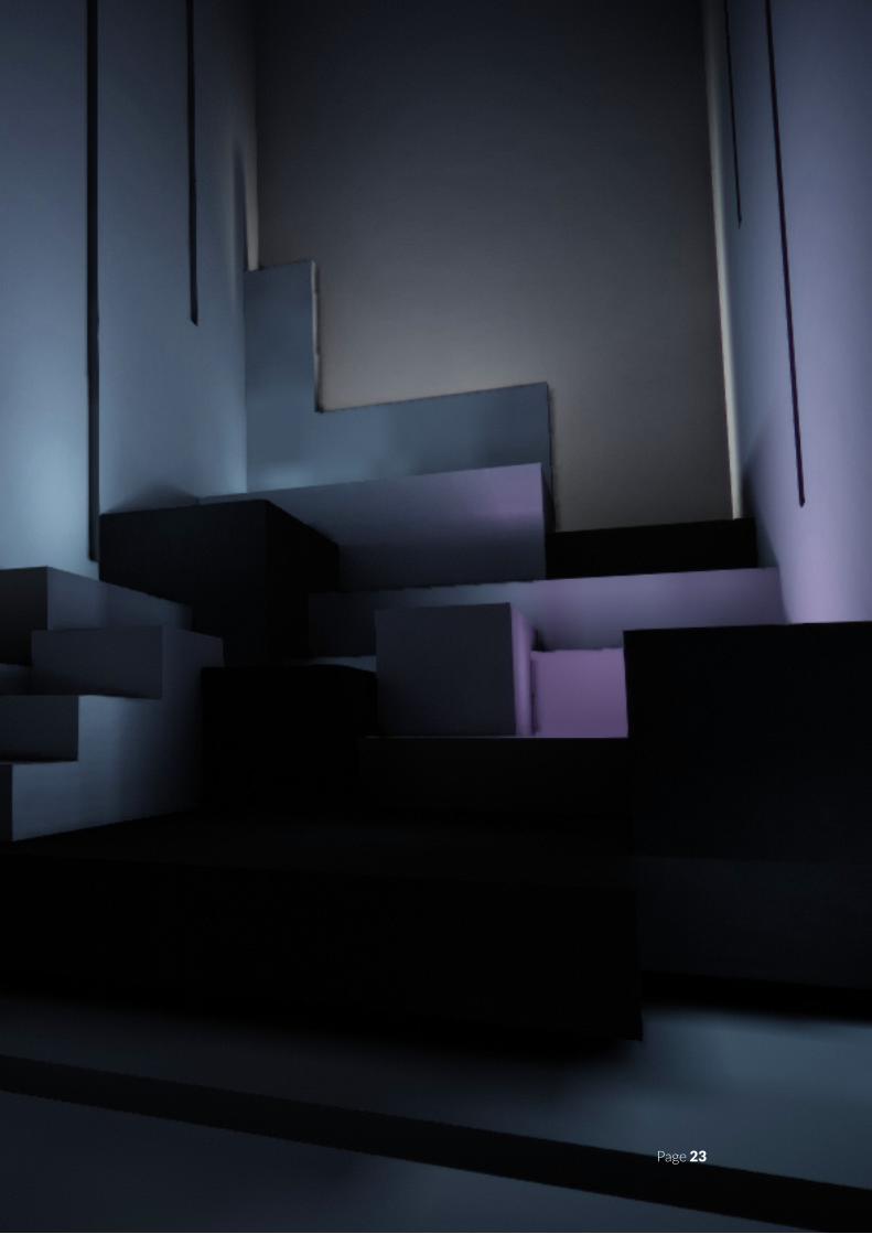
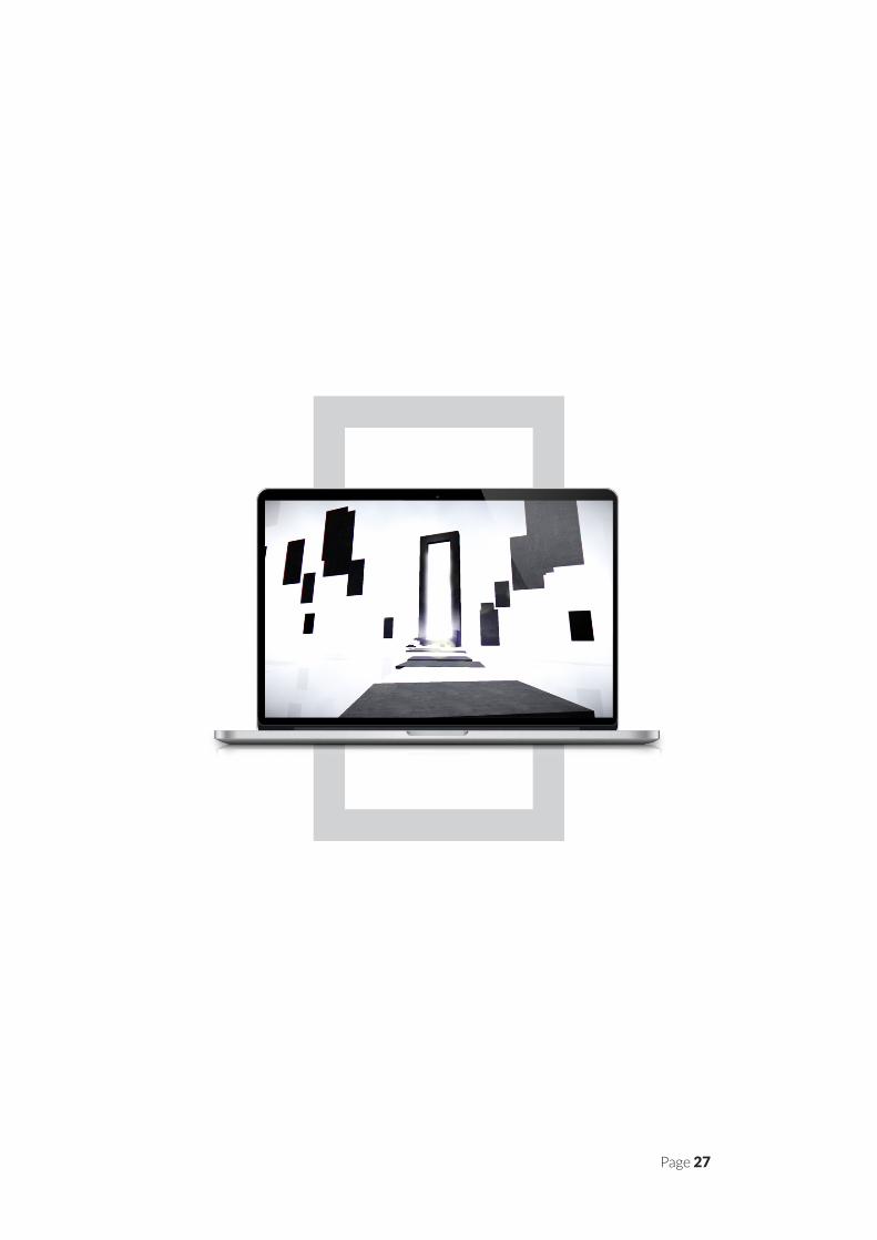
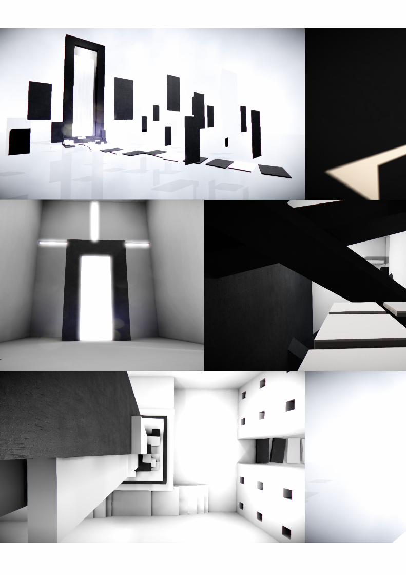
L A B Y R I N T H
S E R I O U S G A M E
Labyrinth is a genre-defying
game that aims to let the
player break through a de-
pressive thinking pattern.
The game tries to empower the player by
overcoming abstracted challenges relat-
ed to the real world.
The confidence gained by triumphing in
the game and the reflection at the end
may give the player the push to have
a more positive outlook and break out
of a depressive thinking pattern. In the
game, the player travels through his sub-
conscious in a story grounded on Dante
Alighieri’s La Divina Commedia.
Within this story, the player’s subcon-
scious has long been his personal refuge
whenever he wanted to escape from his
troubles in the real world. However, one
day, the player’s mind can no longer bear
the piled-up inner problems of the play-
er. The subconscious now challenges
the player to face his demons and get his
things sorted out.
Labyrinth is a genre-defying game. It
combines platform elements with game
parts where no gameplay elements ap-
pear to be present at first, resulting in a
remarkable game experience. The game
features modernist and minimalist, ab-
stract architectural landscapes repre-
senting the player’s subconscious. These
environments are devoid of any ‘realistic’
assets, such as cars, houses etc. yet use a
combination of shape and sound to cre-
ate the illusion of a certain context. This
requires the player to make better use
of his mind and imaginary skills to figure
out the game, increasing the likelihood of
personal reflections.
The game has been developed to a cer-
tain phase for distribution on Windows
and Mac using the award-winning multi-
platform Unreal Engine, the same engine
that powers most of today’s world AAA
titles. It is suitable for play with mouse
and keyboard as well with the Xbox 360
Controller for Windows.
Page 26
Page 27
Page 28
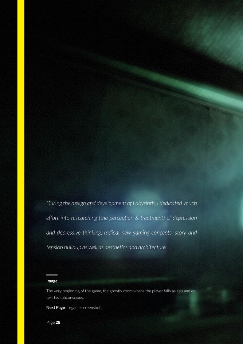
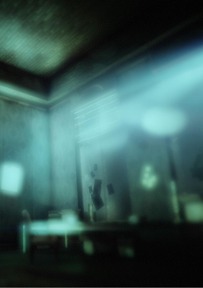
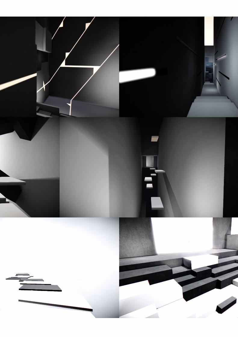
During the design and development of Labyrinth, I dedicated much
effort into researching (the perception & treatment) of depression
and depressive thinking, radical new gaming concepts, story and
tension buildup as well as aesthetics and architecture.
Image
The very beginning of the game, the ghostly room where the player falls asleep and en-
ters his subconscious.
Next Page: in-game screenshots
Page 28
Page 29
Page 30
Page 31
Page 32
S e l e c t e d W o r k
V a r i o u s w o r k
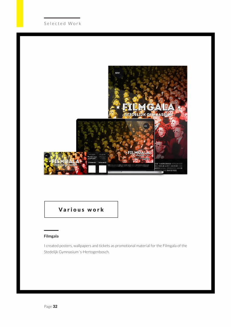
Filmgala
I created posters, wallpapers and tickets as promotional material for the Filmgala of the
Stedelijk Gymnasium ‘s-Hertogenbosch.
Page 33
4
Glasses, lipstick, false teeth, the contraceptive pill and even your mobile phone - we take for granted how commonplace human enhancements are. It is an exciting but feared era of modern science, where sci-fi imaginings are brought to life. What does the future, near and far, hold for humans? Is enhancement the next stage of evolution? Should any limits be imposed?
In a time where Lance Armstrong’s worldwide reputation just changed from a sports hero into a disrespected cheater, doping is the most despised kind of human enhancement. A hundred years ago, fair competition was perceived differently. Tom Hicks was the official winner of the 1904 Olympic marathon in London. The runner had received several doses of strychnine in brandy throughout the race to increase his endurance. Doping was acceptable at the time, but it was not allowed to do intensive training longer than four weeks.
_HANDICAPPED BECOMES HANDICAPABLE
How much freedom should we have to take advantage of new ways to improve our mental and physical performance? Everyone agrees technologies should be used to help the handicapped perform at the regular human level again, filling in parts of the human body that were missing… but can we go further than that? Should we surrender to our greediness and be better, faster and smarter than nature intended us to be? Should handicapped become, handicapable, and maybe even extrahandi? As an example take Tanya Vlach: a director who lost her eye and now wants a camera instead, which is connected to her brain similar to a normal eye. On top of that she wants her new ‘eye’ to be able to take pictures.
Look what we found box
Lorem ipsum dolor sit amet, consectetuer adipiscing elit. Aenean commodo ligula eget dolor. Aenean massa. Cum sociis natoque penatibus et magnis dis parturient montes, nascetur ridiculus mus. Donec quam felis, ultricies nec, pellentesque eu, pretium quis, sem. Nulla consequat massa quis enim. Donec pede justo, fringilla vel, aliquet nec, vulputate eget, arcu. In enim justo, rhoncus ut, imperdiet a, venenatis vitae, justo. Nullam dictum felis eu pede mollis pretium. Integer tincidunt. Cras dapibus. Vivamus elementum semper nisi. Aenean vulputate eleifend tellus. Aenean leo ligula, porttitor eu, consequat vitae, eleifend ac, enim. Aliquam lorem ante, dapibus in, viverra quis, feugiat a, tellus.
Last summer, Oscar Pistorius, nicknamed the Blade Runner, became the first double leg amputee to participate in the Olympics, in the men’s 400 metres race. With his two prosthetics, called the ‘flex-foot cheetah’, he ran himself to the semi-finals. It became the subject of debate: how fair is it to compare artificial limbs with natural ankles and feet?
_WHAT IF..
Although people have long been dreaming of what it might mean to have superpowers and additive capabilities, it seems impossible to imagine these opportunities without considering potential dangers. It is an enduring aspect of the debate surrounding human enhancement: the question of not just what is possible but at what point we should stop. In every super hero movie there is a villain with similar super powers, always underlining the thin line between human enhancements for the good or the bad.
Lay-out Bram de Vogel - Text Tessa Steenkamp
e-Atelier
Lorem ipsum dolor sit amet, consectetuer adipiscing elit. Aenean commodo ligula eget dolor. Aenean massa. Cum sociis natoque penatibus et magnis dis parturient montes, nascetur ridiculus mus. Donec quam felis, ultricies nec, pellentesque eu, pretium quis, sem. Nulla consequat massa quis enim. Donec pede justo, fringilla vel, aliquet nec, vulputate eget, arcu. In enim justo, rhoncus ut, imperdiet a, venenatis vitae, justo. Nullam dictum felis eu pede mollis pretium. Integer tincidunt. Cras dapibus. Vivamus elementum semper nisi. Aenean vulputate eleifend tellus. Aenean leo ligula, porttitor eu, consequat vitae, eleifend ac, enim. Aliquam lorem ante, dapibus in, viverra quis, feugiat a, tellus.
Lorem ipsum dolor sit amet, consectetuer adipiscing elit. Aenean commodo ligula eget dolor. Aenean massa. Cum sociis natoque penatibus et magnis dis parturient montes, nascetur ridiculus mus. Donec quam felis, ultricies nec, pellentesque eu, pretium quis, sem. Nulla consequat massa quis enim. Donec pede justo, fringilla vel, aliquet nec, vulputate eget, arcu. In enim justo, rhoncus ut, imperdiet a, venenatis vitae, justo. Nullam dictum felis eu pede mollis pretium. Integer tincidunt. Cras dapibus. Vivamus elementum semper nisi. Aenean vulputate eleifend tellus. Aenean leo ligula, porttitor eu, consequat vitae, eleifend ac, enim. Aliquam lorem ante, dapibus in, viverra quis, feugiat a, tellus.
Lay-out Mitchell Jacobs - Text Nicolas Nelson
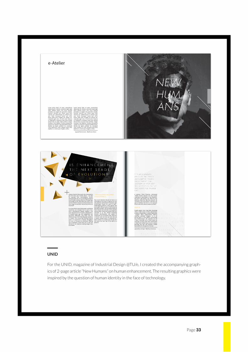
UNID
For the UNID, magazine of Industrial Design @TU/e, I created the accompanying graph-
ics of 2-page article “New Humans” on human enhancement. The resulting graphics were
inspired by the question of human identity in the face of technology.
Page 34
S e l e c t e d W o r k
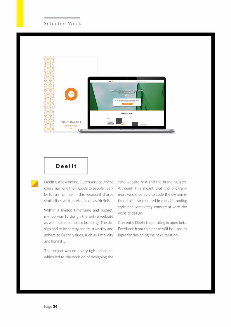
Deelit is a new online, Dutch service where
users may lend their goods to people near-
by for a small fee. In this respect it shares
similarities with services such as AirBnB.
Within a limited timeframe and budget,
my job was to design the entire website
as well as the complete branding. The de-
sign had to be catchy and trustworthy and
adhere to Dutch values, such as simplicity
and honesty.
The project was on a very tight schedule,
which led to the decision of designing the
core website first and the branding later.
Although this meant that the program-
mers would be able to code the system in
time, this also resulted in a final branding
style not completely consistent with the
website design.
Currently Deelit is operating in open beta.
Feedback from this phase will be used as
input for designing the next iteration.
D e e l i t
D E E L I T B R A N D I N G
Design Bram de Vogel,De Jongens van de TU
2013
Page 35
C l i e n tDeelit
Ye a r2012
Ty p eGraphic Design
Wo r k Website / Branding
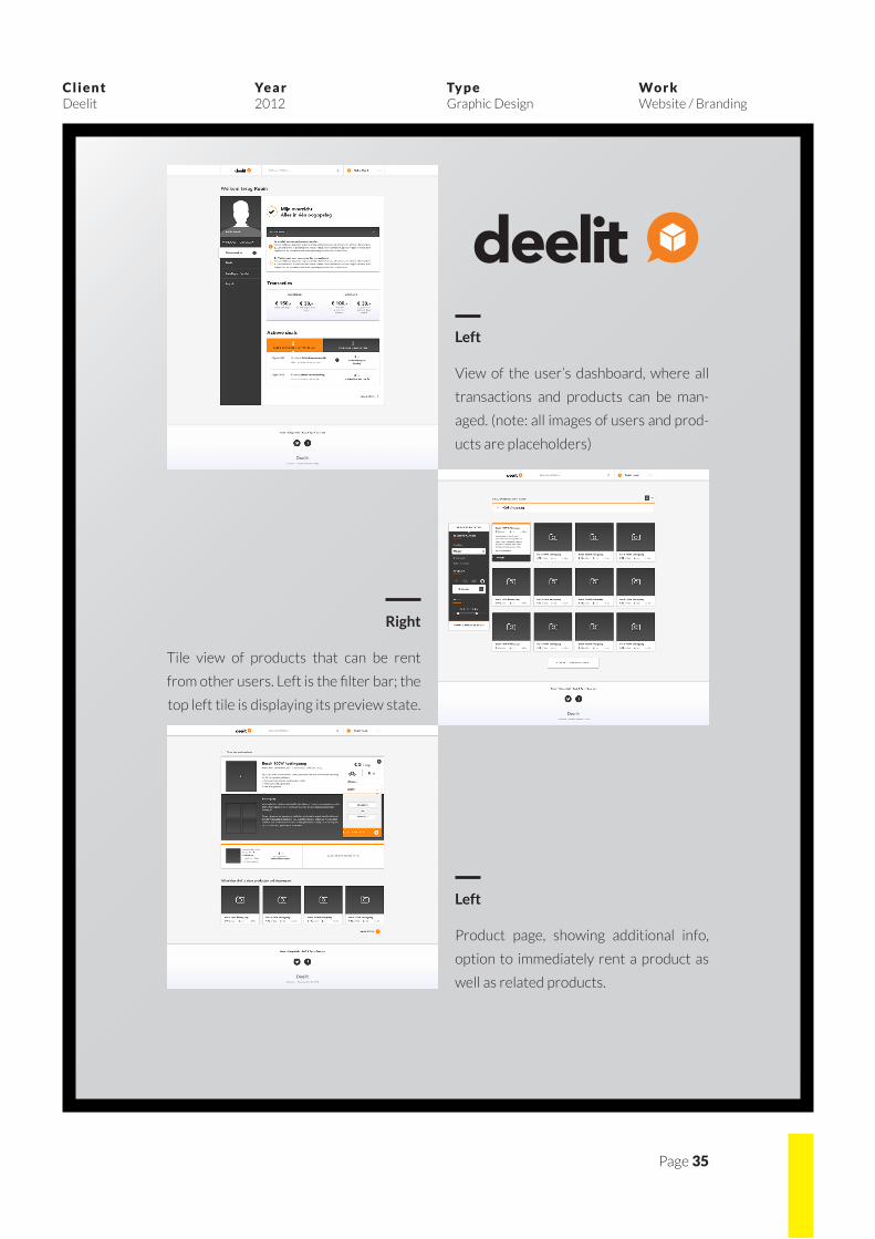
deelitLeft
View of the user’s dashboard, where all
transactions and products can be man-
aged. (note: all images of users and prod-
ucts are placeholders)
Right
Tile view of products that can be rent
from other users. Left is the filter bar; the
top left tile is displaying its preview state.
Left
Product page, showing additional info,
option to immediately rent a product as
well as related products.
Page 36
S e l e c t e d W o r k
++
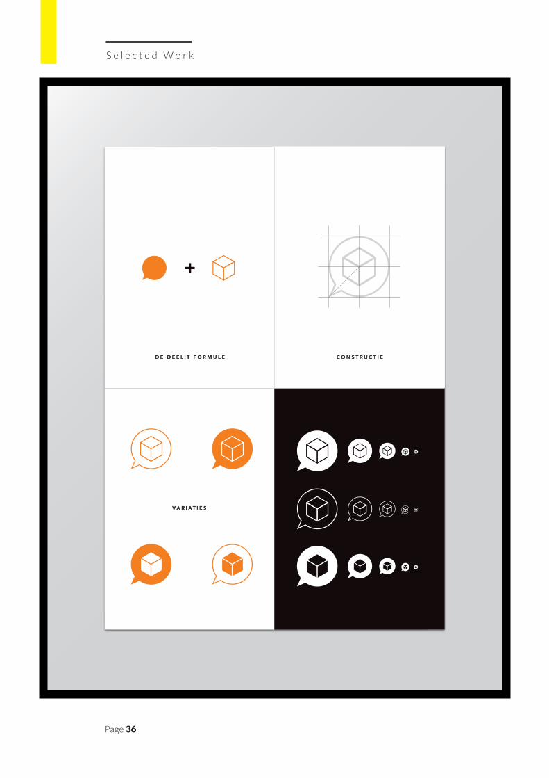
D E D E E L I T F O R M U L E C O N S T R U C T I E
VA R I AT I E S
Page 37
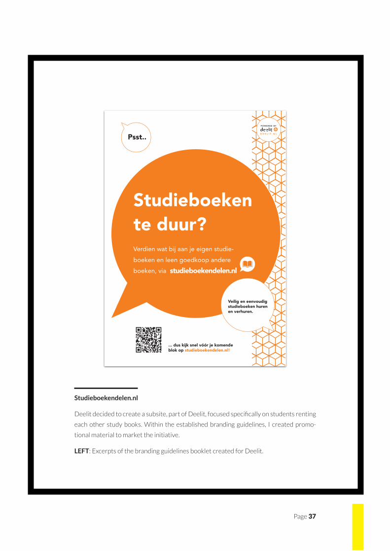
Studieboekendelen.nl
Deelit decided to create a subsite, part of Deelit, focused specifically on students renting
each other study books. Within the established branding guidelines, I created promo-
tional material to market the initiative.
LEFT: Excerpts of the branding guidelines booklet created for Deelit.
Page 38
S e l e c t e d W o r k
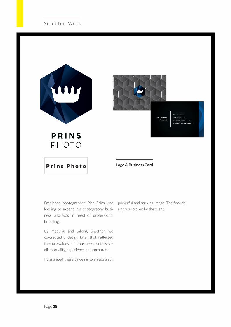
Freelance photographer Piet Prins was
looking to expand his photography busi-
ness and was in need of professional
branding.
By meeting and talking together, we
co-created a design brief that reflected
the core values of his business; profession-
alism, quality, experience and corporate.
I translated these values into an abstract,
powerful and striking image. The final de-
sign was picked by the client.
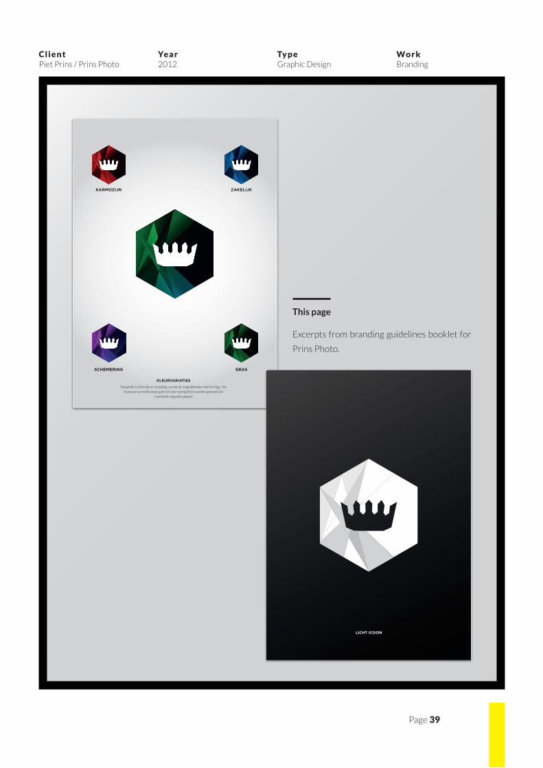
P r i n s P h o t o
P R I N SPHOTO
PIET PRINSFotograaf
T 0 6 8 3 6 0 0 2 9 5
KVK 1 7 2 4 7 1 9 8
I N F O @ P R I N S P H OTO. N L
WWW.PRINSPHOTO.NL
Logo & Business Card
Page 39
C l i e n tPiet Prins / Prins Photo
Ye a r2012
Ty p eGraphic Design
Wo r k Branding
KLEURVARIATIES
Fotografie is kleurrijk en veelzijdig, zo ook de mogelijkheden met het logo. Toe te passen op media waar geen tot zeer weinig foto’s worden getoond (zie
voorbeeld volgende pagina)
KARMOZIJN ZAKELIJK
GRASSCHEMERING
LICHT ICOON
This page
Excerpts from branding guidelines booklet for
Prins Photo.
Page 40
T H A N K Y O U F O R R E A D I N G !