
Presentatie mobile proof - April 2015 - MKB Noord
18
Hoe ‘Mobile Proof’ is uw website? Lezing MKB-Noord / VNO-NCW Dinsdag 21 april 2015 Corné Kox & Hans Blaettler Corné Hans Hoe ‘Mobile Proof’ is uw website MKB-Noord / VNO-NCW | 21 april 2015
Transcript of Presentatie mobile proof - April 2015 - MKB Noord
Hoe ‘Mobile Proof’ is uw website?
Lezing MKB-Noord / VNO-NCW Dinsdag 21 april 2015 Corné Kox & Hans Blaettler
Corné Hans
Hoe ‘Mobile Proof’ is uw website MKB-Noord / VNO-NCW | 21 april 2015
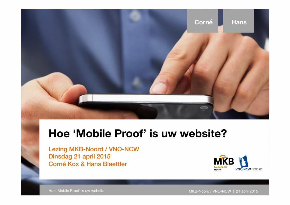
De geschiedenis van het web
Van Arpanet naar het World Wide Web
Corné Hans
Hoe ‘Mobile Proof’ is uw website MKB-Noord / VNO-NCW | 21 april 2015
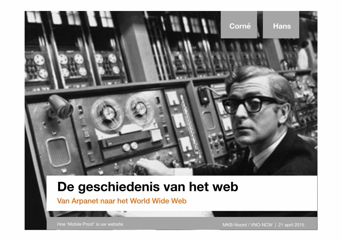
Feiten en cijfers
Groei van mobiel dataverkeer
Corné Hans
Hoe ‘Mobile Proof’ is uw website MKB-Noord / VNO-NCW | 21 april 2015
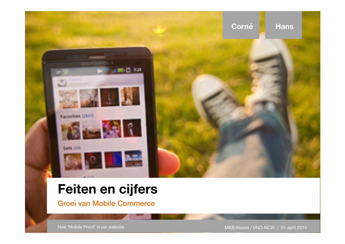
Feiten en cijfers
Groei van Mobile Commerce
Corné Hans
Hoe ‘Mobile Proof’ is uw website MKB-Noord / VNO-NCW | 21 april 2015
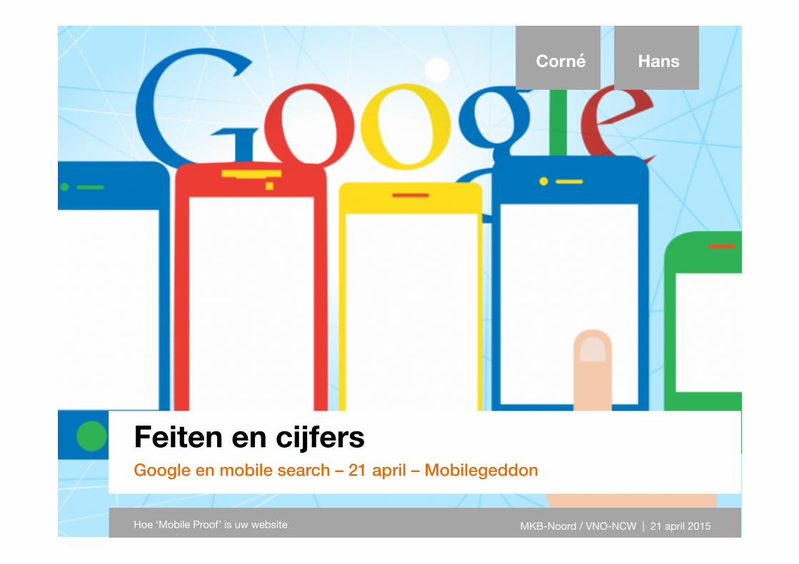
Feiten en cijfers
Google en mobile search – 21 april – Mobilegeddon
Corné Hans
Hoe ‘Mobile Proof’ is uw website MKB-Noord / VNO-NCW | 21 april 2015
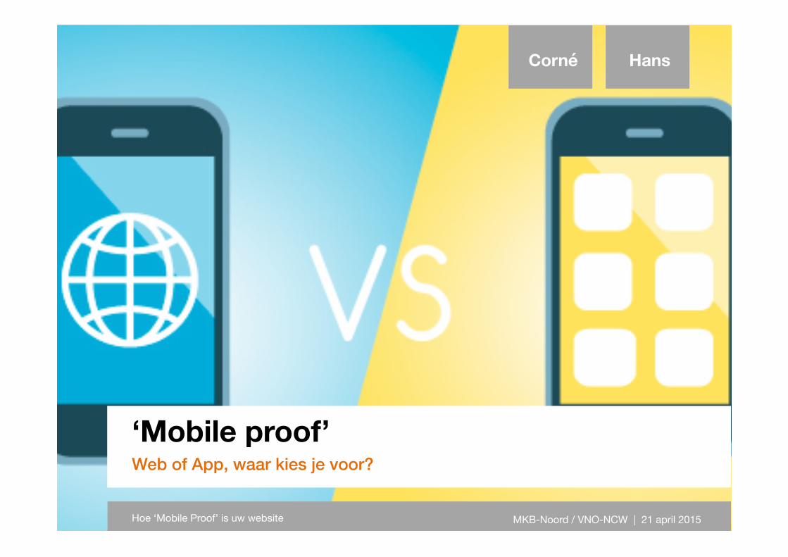
‘Mobile proof’
Web of App, waar kies je voor?
Corné Hans
Hoe ‘Mobile Proof’ is uw website MKB-Noord / VNO-NCW | 21 april 2015
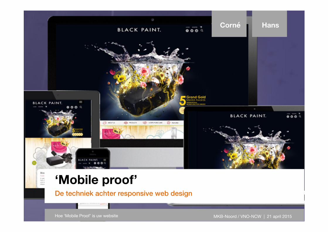
‘Mobile proof’
De techniek achter responsive web design
Corné Hans
Hoe ‘Mobile Proof’ is uw website MKB-Noord / VNO-NCW | 21 april 2015
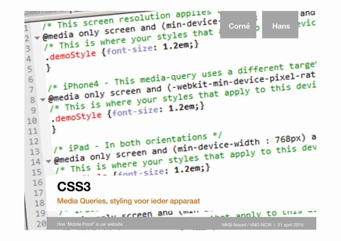
CSS3
Media Queries, styling voor ieder apparaat
Corné Hans
Hoe ‘Mobile Proof’ is uw website MKB-Noord / VNO-NCW | 21 april 2015
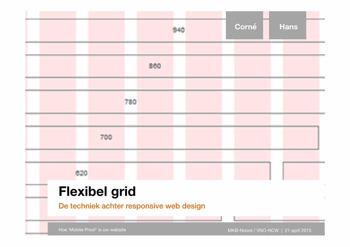
Flexibel grid
De techniek achter responsive web design
Corné Hans
Hoe ‘Mobile Proof’ is uw website MKB-Noord / VNO-NCW | 21 april 2015
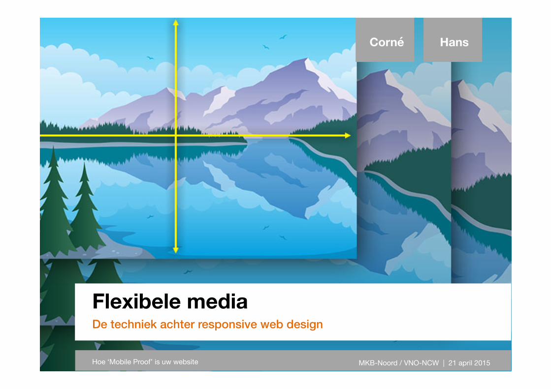
Flexibele media
De techniek achter responsive web design
Corné Hans
Hoe ‘Mobile Proof’ is uw website MKB-Noord / VNO-NCW | 21 april 2015
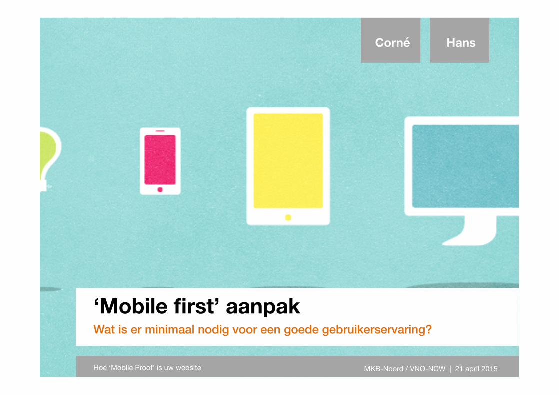
‘Mobile first’ aanpak
Wat is er minimaal nodig voor een goede gebruikerservaring?
Corné Hans
Hoe ‘Mobile Proof’ is uw website MKB-Noord / VNO-NCW | 21 april 2015
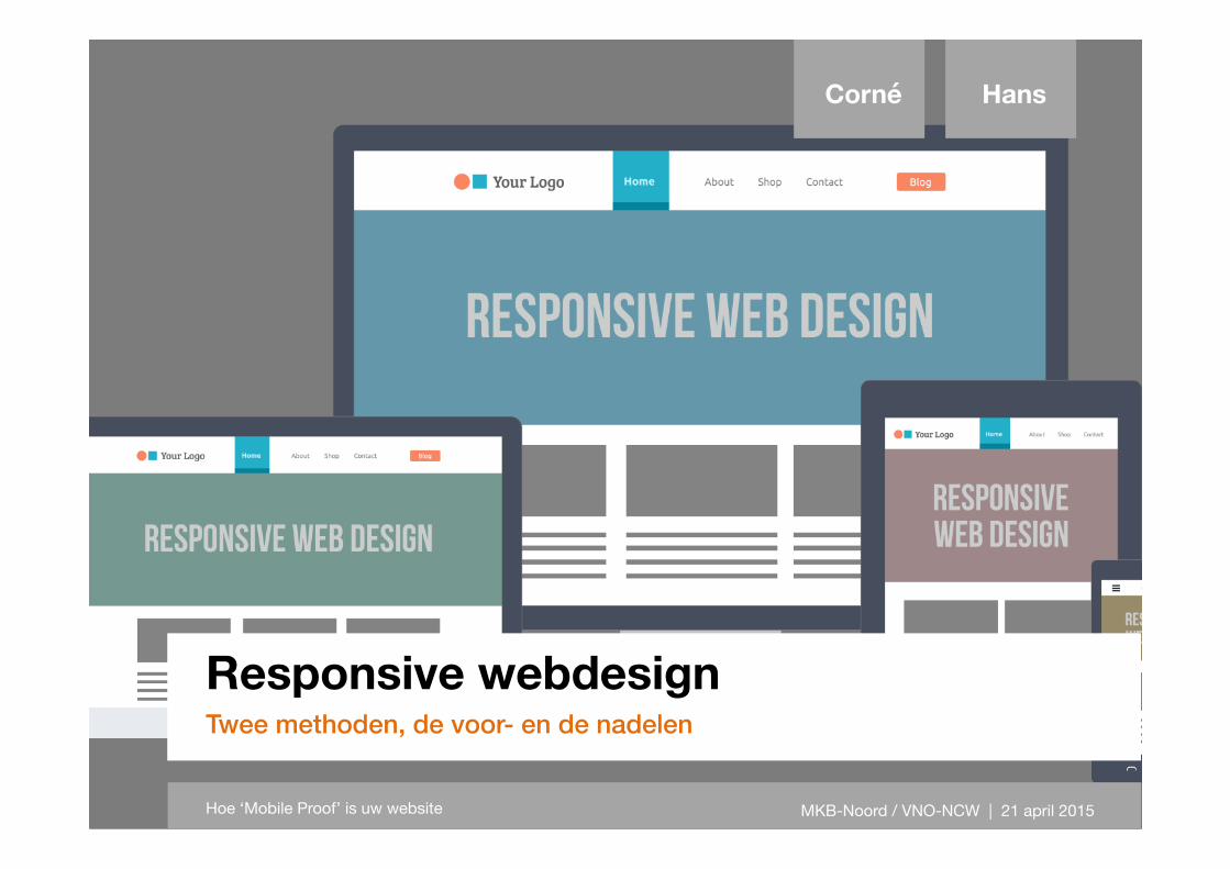
Responsive webdesign
Twee methoden, de voor- en de nadelen
Corné Hans
Hoe ‘Mobile Proof’ is uw website MKB-Noord / VNO-NCW | 21 april 2015
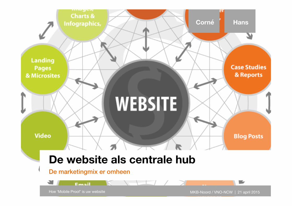
De website als centrale hub
De marketingmix er omheen
Corné Hans
Hoe ‘Mobile Proof’ is uw website MKB-Noord / VNO-NCW | 21 april 2015
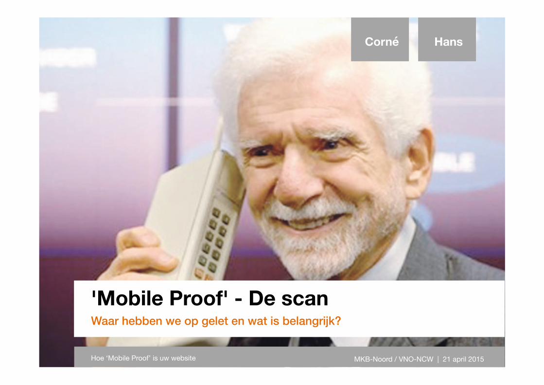
'Mobile Proof' - De scan
Waar hebben we op gelet en wat is belangrijk?
Corné Hans
Hoe ‘Mobile Proof’ is uw website MKB-Noord / VNO-NCW | 21 april 2015
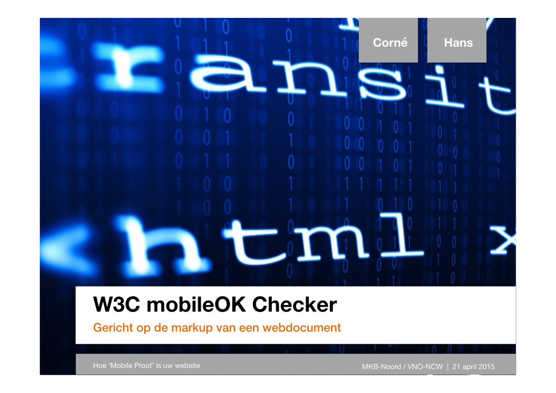
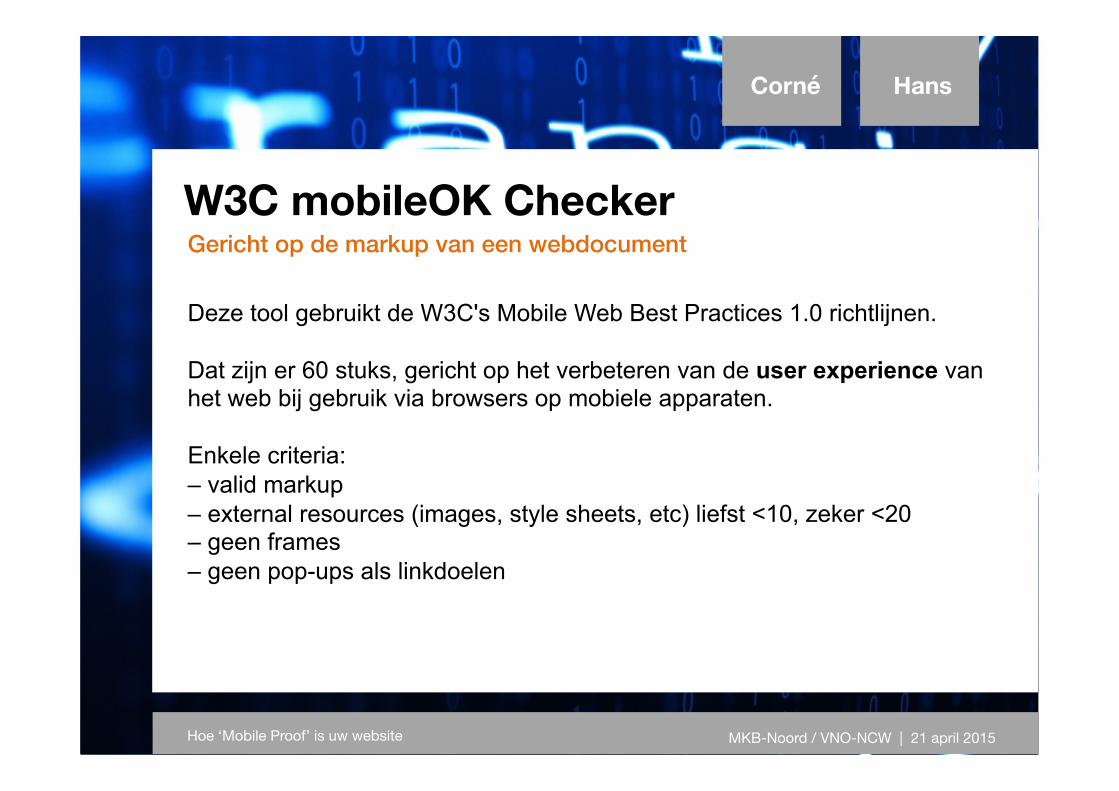
W3C mobileOK Checker
Gericht op de markup van een webdocument
Corné Hans
Hoe ‘Mobile Proof’ is uw website MKB-Noord / VNO-NCW | 21 april 2015
W3C mobileOK Checker Gericht op de markup van een webdocument
Corné Hans
Hoe ‘Mobile Proof’ is uw website MKB-Noord / VNO-NCW | 21 april 2015
Deze tool gebruikt de W3C's Mobile Web Best Practices 1.0 richtlijnen. Dat zijn er 60 stuks, gericht op het verbeteren van de user experience van het web bij gebruik via browsers op mobiele apparaten. Enkele criteria: – valid markup – external resources (images, style sheets, etc) liefst <10, zeker <20 – geen frames – geen pop-ups als linkdoelen
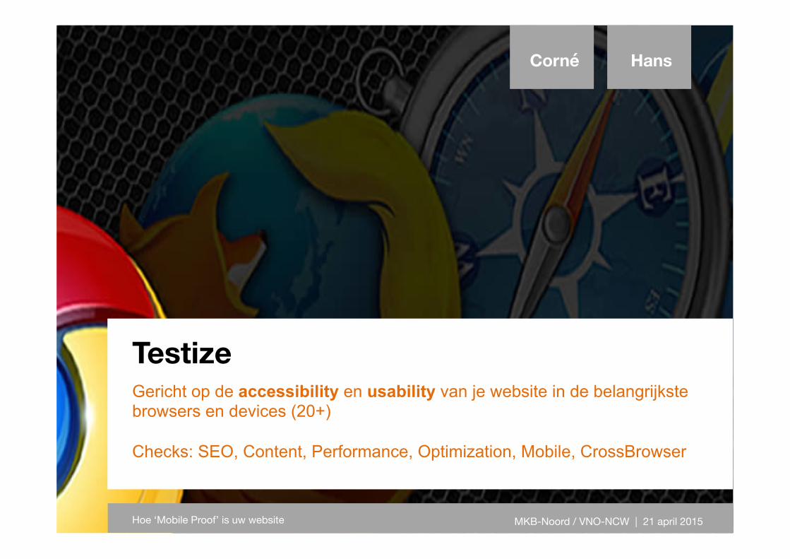
Testize
Gericht op de accessibility en usability van je website in de belangrijkste browsers en devices (20+) Checks: SEO, Content, Performance, Optimization, Mobile, CrossBrowser
Corné Hans
Hoe ‘Mobile Proof’ is uw website MKB-Noord / VNO-NCW | 21 april 2015
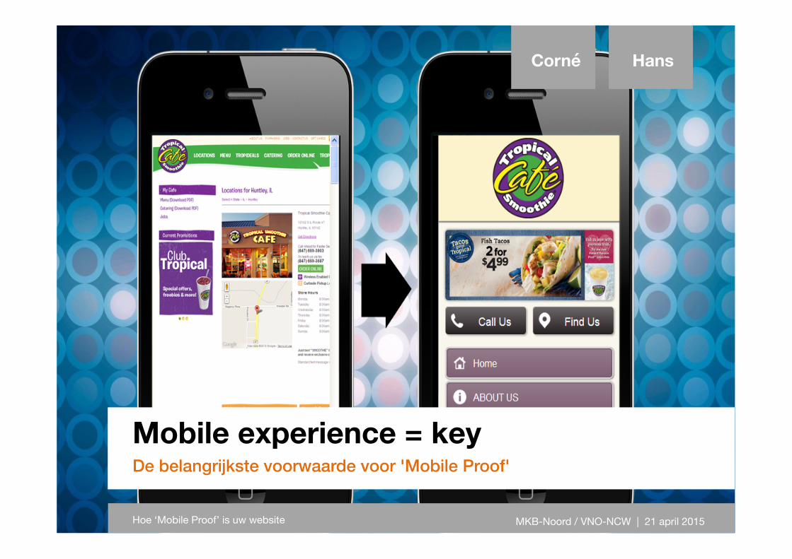
Mobile experience = key
De belangrijkste voorwaarde voor 'Mobile Proof'
Corné Hans
Hoe ‘Mobile Proof’ is uw website MKB-Noord / VNO-NCW | 21 april 2015