1:1 SETS FOR ERWIN OLAF · en Romeinse architectuur en ontwierp een Romeins castrum met een...
56
1:1 SETS FOR ERWIN OLAF BY FLORIS VOS BEKLEIDUNG
Transcript of 1:1 SETS FOR ERWIN OLAF · en Romeinse architectuur en ontwierp een Romeins castrum met een...
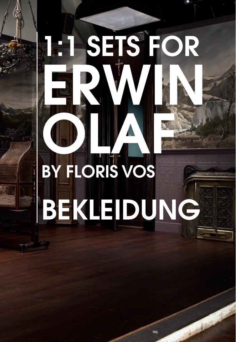
1:1 SETS FOR
ERWINOLAFBY FLORIS VOS
BEKLEIDUNG

3
Ieder begin is per definitie hoopvol; alles lijkt mogelijk, gevoed door nieuws-gierigheid en beschermd door onbekendheid. Deze publicatie vertegenwoordigt een dergelijk begin. Uitgegeven ter gelegenheid van de tentoonstellingen 1:1 Sets for Erwin Olaf en Bekleidung markeert deze uitgave de hoopvolle start van het meerjarige onderzoeksprogramma Landschap en Interieur van Het Nieuwe Instituut. Dit programma benadert het interieur niet uitsluitend als de ontstaansgrond van de architectuur, maar tegelijkertijd als het snijpunt van de drie disciplines, die Het Nieuwe Instituut vertegenwoordigt; architectuur, design en e-cultuur.
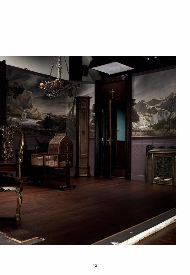
Allereerst bevat deze publicatie verschillende, veelal bekende, beelden van Erwin Olaf. Bovendien is niet eerder gepubliceerd materiaal van de nog lege decors opgenomen, die Olaf voor zijn beelden benut; ontdaan van het model en gestript van een verhaallijn. Deze decors, ontworpen door Floris Vos, geven niet alleen een verrassend inzicht in de totstandkoming van het oeuvre van Olaf, ze vormen ook de aanleiding voor het essay, van de hand van Brendan Cormier, dat eveneens onderdeel van deze publicatie vormt. Dit essay slaat een brug tussen het oeuvre van Olaf, de sets van Vos en de door Erich Weiss gecureerde tentoonstelling Bekleidung, waarin behang door verschillende nationale en internationale kunstenaars (onder wie Damien Hirst, Sylvie Fleurie en Willem Oorebeek) als een betekenisvolle huid wordt opgevat. Dit essay geeft allereerst een historische schets van het begrip Bekleidung, maar gaat ook in op de invloeden waaraan het interieur onderhevig is, waardoor de grenzen van deze ruimte steeds opnieuw worden gedefinieerd. Het Nieuwe Instituut wil deze grenzen de komende jaren verkennen om aan de hand hiervan de veranderende rol en betekenis van het interieur ter discussie te stellen en verschuivingen, waaronder de onderlinge verhouding tussen architectuur, design en e-cultuur, zichtbaar te maken.
Wij nodigen u graag uit het programma Landschap en Interieur te blijven volgen, ver voorbij dit begin!
November 2013Het Nieuwe Instituut
VOORBIJ DIT BEGINGuus Beumer
4
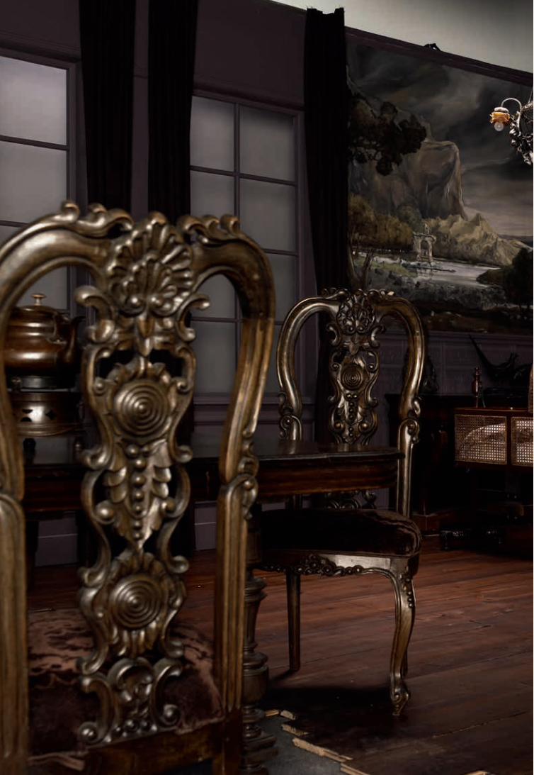
Olafs werkelijkheid is een weergave van zijn innerlijke belevingswereld, de wereld van zijn eigen fantasie. De wereld van Olaf is tegenstrijdig, het pathos druipt er van het behang en de buitenwereld blijft verborgen achter gordijnen. De modellen hebben een ambivalente uitdrukking op hun gezicht en alle objecten spelen een rol in de compositie: een zorgvuldig
In de documentaire On Beauty and Fall zegt de gevierde Nederlandse kunstenaar Erwin Olaf dat de werkelijkheid hem niet interesseert. Hij betreurt het dat de kunstwereld altijd zo verrukt is van documentaire fotografie, omdat die een ernstige weergave van de werkelijkheid zou zijn, terwijl het feitelijk slechts een constructie is: die van de kunstenaar.
BIJ GEBREK AAN WERKELIJK-HEID: Erwin Olaf en het geconstrueerde interieurBrendan Cormier
4 5
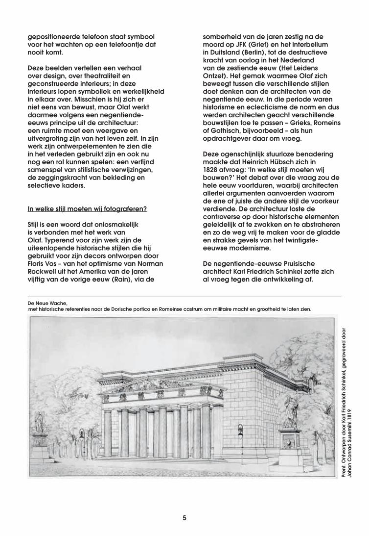
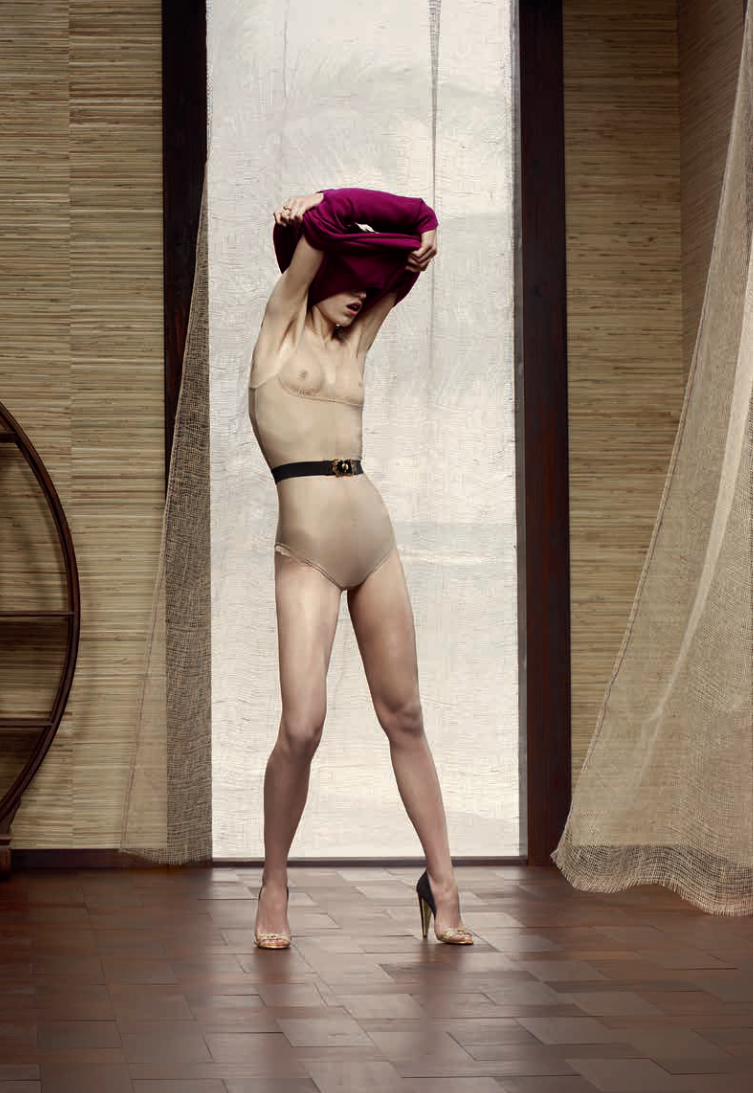
somberheid van de jaren zestig na de moord op JFK (Grief) en het interbellum in Duitsland (Berlin), tot de destructieve kracht van oorlog in het Nederland van de zestiende eeuw (Het Leidens Ontzet). Het gemak waarmee Olaf zich beweegt tussen die verschillende stijlen doet denken aan de architecten van de negentiende eeuw. In die periode waren historisme en eclecticisme de norm en dus werden architecten geacht verschillende bouwstijlen toe te passen – Grieks, Romeins of Gothisch, bijvoorbeeld – als hun opdrachtgever daar om vroeg.
Deze ogenschijnlijk stuurloze benadering maakte dat Heinrich Hübsch zich in 1828 afvroeg: ‘In welke stijl moeten wij bouwen?’ Het debat over die vraag zou de hele eeuw voortduren, waarbij architecten allerlei argumenten aanvoerden waarom de ene of juiste de andere stijl de voorkeur verdiende. De architectuur loste de controverse op door historische elementen geleidelijk af te zwakken en te abstraheren en zo de weg vrij te maken voor de gladde en strakke gevels van het twintigste-eeuwse modernisme.
De negentiende-eeuwse Pruisische architect Karl Friedrich Schinkel zette zich al vroeg tegen die ontwikkeling af.
gepositioneerde telefoon staat symbool voor het wachten op een telefoontje dat nooit komt.
Deze beelden vertellen een verhaal over design, over theatraliteit en geconstrueerde interieurs; in deze interieurs lopen symboliek en werkelijkheid in elkaar over. Misschien is hij zich er niet eens van bewust, maar Olaf werkt daarmee volgens een negentiende-eeuws principe uit de architectuur: een ruimte moet een weergave en uitvergroting zijn van het leven zelf. In zijn werk zijn ontwerpelementen te zien die in het verleden gebruikt zijn en ook nu nog een rol kunnen spelen: een verfijnd samenspel van stilistische verwijzingen, de zeggingskracht van bekleding en selectieve kaders.
In welke stijl moeten wij fotograferen?
Stijl is een woord dat onlosmakelijk is verbonden met het werk van Olaf. Typerend voor zijn werk zijn de uiteenlopende historische stijlen die hij gebruikt voor zijn decors ontworpen door Floris Vos – van het optimisme van Norman Rockwell uit het Amerika van de jaren vijftig van de vorige eeuw (Rain), via de
Pren
t. O
ntw
orpe
n do
or K
arl F
riedr
ich
Schi
nkel
, geg
rave
erd
door
Jo
han
Con
rad
Suse
mih
l.181
9
De Neue Wache, met historische referenties naar de Dorische portico en Romeinse castrum om militaire macht en grootheid te laten zien.
6
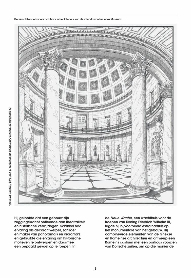
Hij geloofde dat een gebouw zijn zeggingskracht ontleende aan theatraliteit en historische verwijzingen. Schinkel had ervaring als decorontwerper, schilder en maker van panorama’s en diorama’s en gebruikte die ervaring om historische motieven te ontwerpen en daarmee een bepaald gevoel op te roepen. In
de Neue Wache, een wachthuis voor de troepen van Koning Friedrich Wilhelm III, legde hij bijvoorbeeld extra nadruk op het monumentale van het gebouw. Hij combineerde elementen van de Griekse en Romeinse architectuur en ontwierp een Romeins castrum met een porticus voorzien van Dorische zuilen, om op die manier de
Perspectivische gravure. Ontw
orpen en gegraveerd door Karl Friedrich Schinkel.
De verschillende kaders zichtbaar in het interieur van de rotunda van het Altes Museum.
6 7
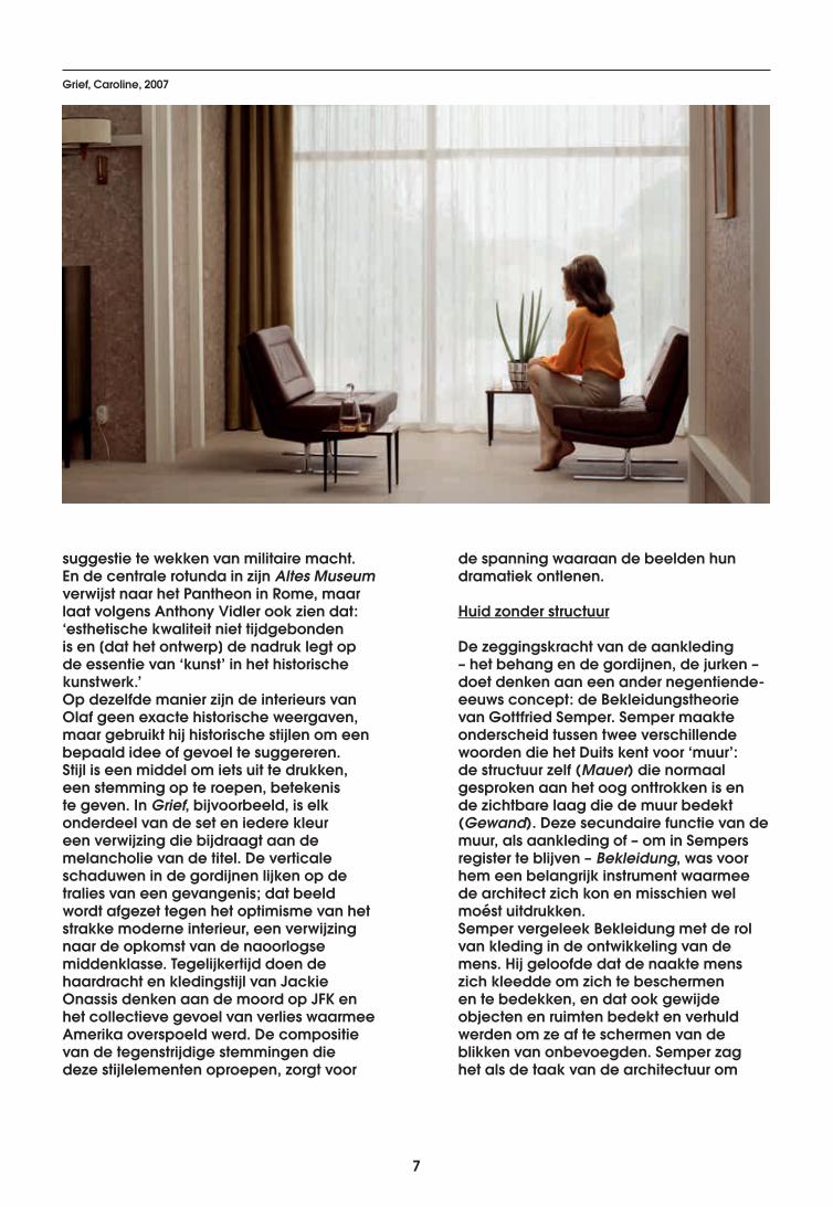
suggestie te wekken van militaire macht. En de centrale rotunda in zijn Altes Museum verwijst naar het Pantheon in Rome, maar laat volgens Anthony Vidler ook zien dat: ‘esthetische kwaliteit niet tijdgebonden is en [dat het ontwerp] de nadruk legt op de essentie van ‘kunst’ in het historische kunstwerk.’Op dezelfde manier zijn de interieurs van Olaf geen exacte historische weergaven, maar gebruikt hij historische stijlen om een bepaald idee of gevoel te suggereren. Stijl is een middel om iets uit te drukken, een stemming op te roepen, betekenis te geven. In Grief, bijvoorbeeld, is elk onderdeel van de set en iedere kleur een verwijzing die bijdraagt aan de melancholie van de titel. De verticale schaduwen in de gordijnen lijken op de tralies van een gevangenis; dat beeld wordt afgezet tegen het optimisme van het strakke moderne interieur, een verwijzing naar de opkomst van de naoorlogse middenklasse. Tegelijkertijd doen de haardracht en kledingstijl van Jackie Onassis denken aan de moord op JFK en het collectieve gevoel van verlies waarmee Amerika overspoeld werd. De compositie van de tegenstrijdige stemmingen die deze stijlelementen oproepen, zorgt voor
de spanning waaraan de beelden hun dramatiek ontlenen.
Huid zonder structuur
De zeggingskracht van de aankleding – het behang en de gordijnen, de jurken – doet denken aan een ander negentiende-eeuws concept: de Bekleidungstheorie van Gottfried Semper. Semper maakte onderscheid tussen twee verschillende woorden die het Duits kent voor ‘muur’: de structuur zelf (Mauer) die normaal gesproken aan het oog onttrokken is en de zichtbare laag die de muur bedekt (Gewand). Deze secundaire functie van de muur, als aankleding of – om in Sempers register te blijven – Bekleidung, was voor hem een belangrijk instrument waarmee de architect zich kon en misschien wel moést uitdrukken. Semper vergeleek Bekleidung met de rol van kleding in de ontwikkeling van de mens. Hij geloofde dat de naakte mens zich kleedde om zich te beschermen en te bedekken, en dat ook gewijde objecten en ruimten bedekt en verhuld werden om ze af te schermen van de blikken van onbevoegden. Semper zag het als de taak van de architectuur om
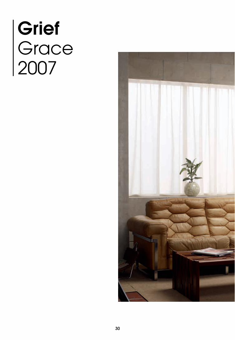
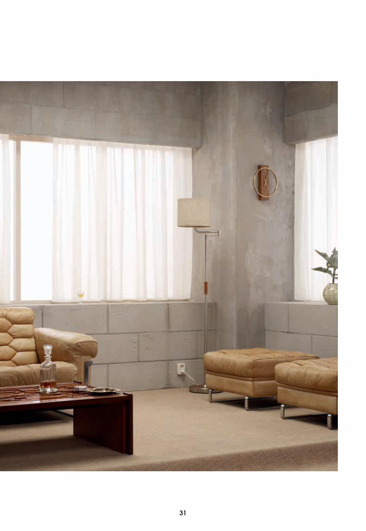
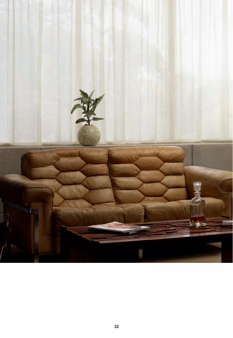
Grief, Caroline, 2007
8
culturele en maatschappelijke ideeën ruimtelijk vorm te geven. Bekleidung was een middel om dat doel te bereiken, met kleuren, ornamentatie en patronen. Hij zag ook mogelijkheden voor synergie tussen Bekleidung en andere culturele producten, zoals textiel en keramiek. Adolf Loos zou het begrip later nog meer historisch gewicht geven, door te stellen dat Bekleidung er zelfs eerder was dan structuur: nomadische stammen gebruikten textiel en dierenhuiden om tenten te bouwen. Voor er structuur was, bestond architectuur uit bekleidung.
De moderne architecten van de twintigste eeuw wezen de Bekleidungstheorie van Semper uiteindelijk af en richtten zich op pure vormen en egale vlakken. De modernen zagen ornamentatie als iets dat de ware natuur van het object in de weg stond. Loos zou ornamentatie zelfs achterlijk en primitief noemen, en Le Corbusier werd bekend als fervent pleitbezorger van witgepleisterde muren.
Moderne architecten beschouwden de ontwikkelingen in de bouwkunst als een grote vooruitgang, die zou leiden tot een neutrale en universele architectuur in de toekomst. Een fundamentele fout in hun redenering was echter dat die voorbijging aan het feit dat de keus voor pleisterwerk op zich al een culturele betekenis inhield. Het was net als ornamentatie een instrument waarmee men iets kon uitdrukken, en dus een vorm van Bekleidung.
Intussen begonnen ornamentatie en bekleidung aan een opmars in Amerikaanse woningen, met een alsmaar toenemend aanbod aan decoratief behang, huishoudelijke artikelen en meubilair. De wat schrale houtskeletbouw die overal in de Amerikaanse buitenwijken verrees, was niet bepaald de moeite van het bekijken waard, dus er ontstond een hele nieuwe markt voor woninginrichting, zodat geen oppervlak onbedekt hoefde te blijven. Woonbladen en de televisie kregen
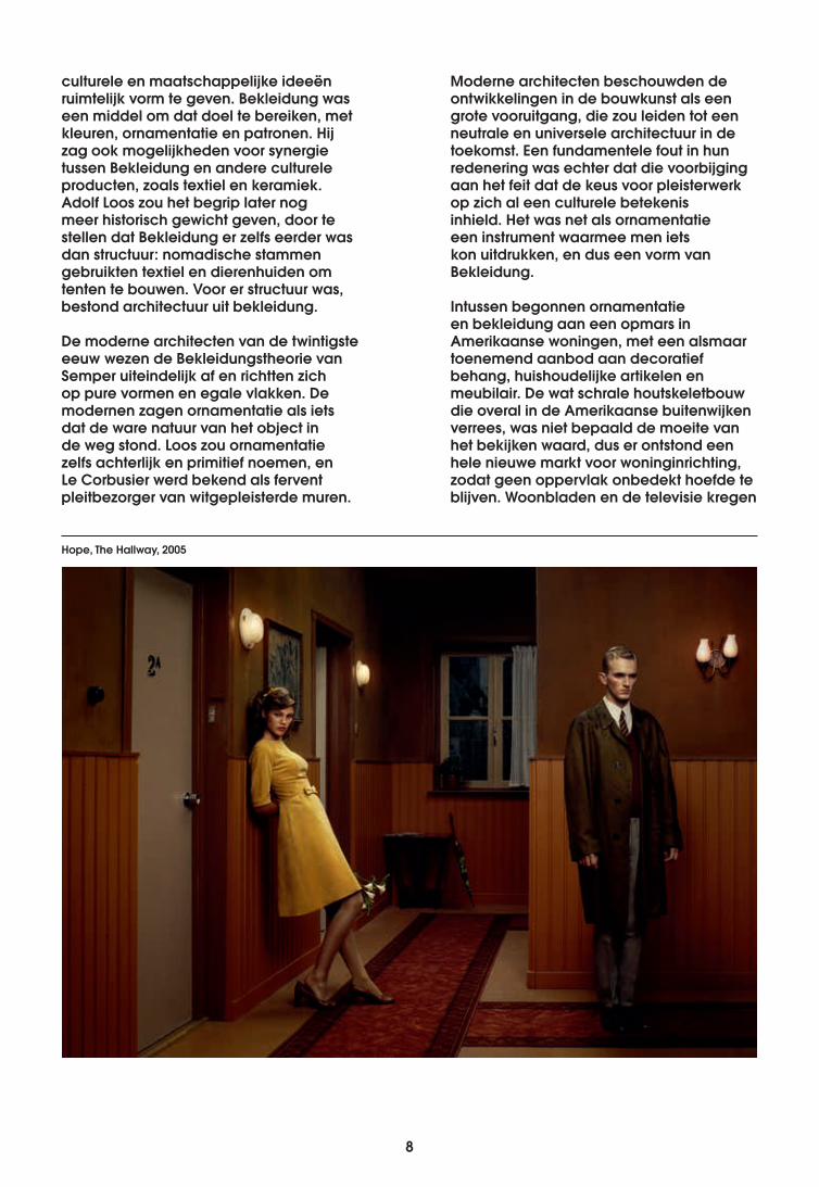
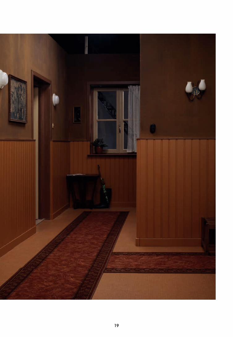
Hope, The Hallway, 2005
8 9
steeds meer invloed op de smaak van hun publiek en gingen hen voorschrijven hoe ze moesten leven en wat ze moesten kopen. Die aankleding en inrichting – een gecommercialiseerde vorm van Bekleidung – zeggen natuurlijk meer over de maatschappij dan over de architectuur van dat moment. Zo’n interieur zegt iets over de Zeitgeist, over het verlangen naar objecten en statussymbolen van een bepaald design. Om die reden is het misschien niet zo vreemd dat Olaf zijn camera richt op beelden die de consument herkent – want we zijn allemaal consumenten en kunnen de historische betekenis die de beelden hebben gemakkelijk lezen en interpreteren.Om terug te komen bij Olafs decors: het valt op dat ze bestaan uit louter aankleding en geen structuur. Daarmee staan de decors grappig genoeg heel dichtbij de nomadische oorsprong van architectuur zoals Loos die zag. Het feit dat je de decors kunt inpakken en verplaatsen
van zijn studio naar een expositieruimte onderstreept dat idee. En het feit dat de foto’s ondanks de ontbrekende structuur nog altijd zo veel te zeggen hebben, toont de waarde van Sempers Bekleidungstheorie aan.
Het leven in kaders
In de wereld van Olaf wordt niet alleen de blik van de toeschouwer, maar ook die van de acteurs gestuurd door gekaderde beelden. Zo zijn de interieurs immers opgebouwd: als een verzameling beelden die de blik vangen en sturen. Je blik valt op een beeld dat vaak zo intiem is dat je je een voyeur voelt. Ook de acteurs in de scène zijn zich bewust van die gekaderde beelden: het raam met uitzicht op een tuin, de manier waarop de meubels zijn uitgelicht, de fraai gedekte tafel of de lens van de camera die je
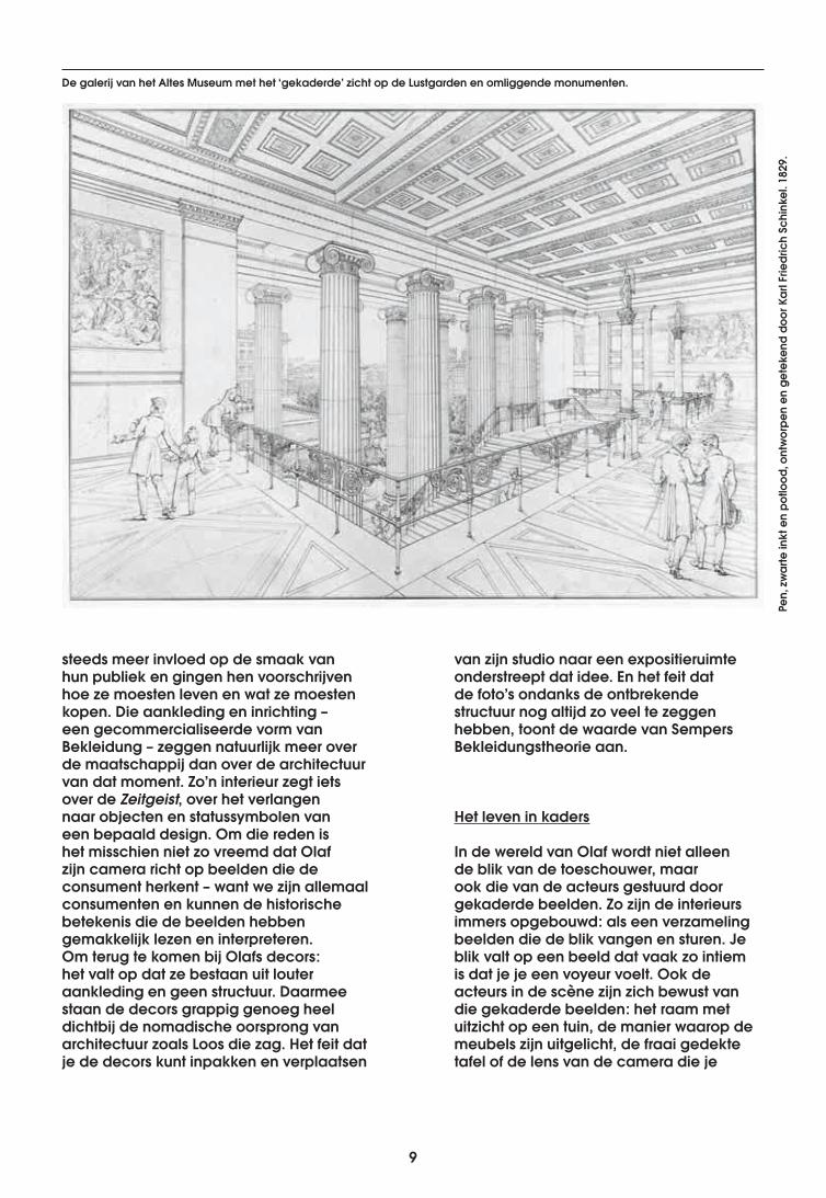
De galerij van het Altes Museum met het ‘gekaderde’ zicht op de Lustgarden en omliggende monumenten.
Pen,
zw
arte
inkt
en
potlo
od, o
ntw
orpe
n en
get
eken
d do
or K
arl F
riedr
ich
Schi
nkel
. 182
9.
10
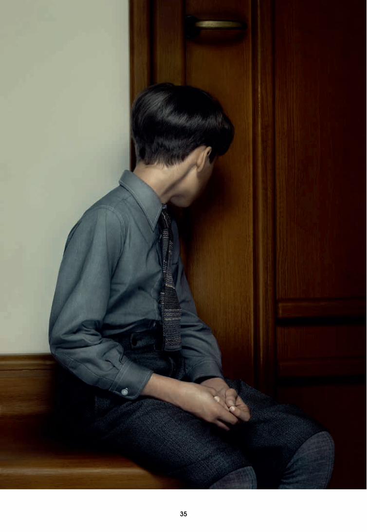
recht aanstaart. In een werk als Keyhole is voyeurisme duidelijk aanwezig. De acteur zit met zijn rug naar je toe, dus je kunt hem ongestoord bekijken; maar het beeld is strak ingekaderd (alsof je door het sleutelgat kijkt) en je blikveld is beperkt. In beelden met een ruimer kader, zoals Hope, kijk je de modellen in de ogen en geeft hun verstilde verwachting je een ongemakkelijk gevoel. Ook deze ideeën over gekaderde beelden zijn te herleiden tot de werken van Semper en Schinkel uit de negentiende eeuw. Zij waren beiden van mening dat architectuur een kader is dat de gehele menselijke ervaring zou moeten omvatten. Schinkels ervaring als decorontwerper bracht hem de overtuiging dat een beeld de aandacht van de toeschouwer moest trekken, om zo de aandacht op de dramatiek van het leven te vestigen. In zijn schilderijen was Schinkel daar uitgesproken succesvol in, vooral in de manier waarop hij de overgang van binnen naar buiten wist uit te lichten. In die schilderijen moet de
toeschouwer vaak door een zuilengalerij naar het landschap daarbuiten kijken, vanuit een besloten ruimte afgebakend door een ondoorzichtige materie, naar een open ruimte met daglicht en diepte. Het zal geen verrassing zijn dat zuilengalerijen later een belangrijke rol zouden spelen in zijn architectuur. De gevel van het Altes Museum gaat bijvoorbeeld schuil achter een brede zuilengalerij die het uitzicht op de Lustgarten en de monumentale gebouwen daarachter in kaders aan de kijker toont. Bij de rotunda van het museum is van alles te zien; verschillende beelden strijden om de aandacht. De zuilen rondom kaderen de standbeelden in en de oculus in koepel toont niet alleen een cirkelvormig beeld van de lucht erboven, maar trekt ook door de aandacht naar het midden van de rotunda door het licht dat erdoor naar binnen valt.
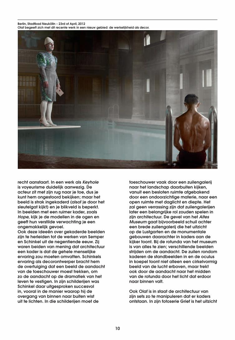
Ook Olaf is in staat de architectuur van zijn sets zo te manipuleren dat er kaders ontstaan. In zijn fotoserie Grief is het uitzicht
Berlin, Stadtbad Neukölln – 23rd of April, 2012Olaf begeeft zich met dit recente werk in een nieuw gebied: de werkelijkheid als decor.
10 11
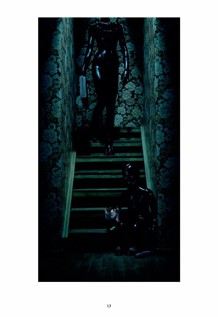
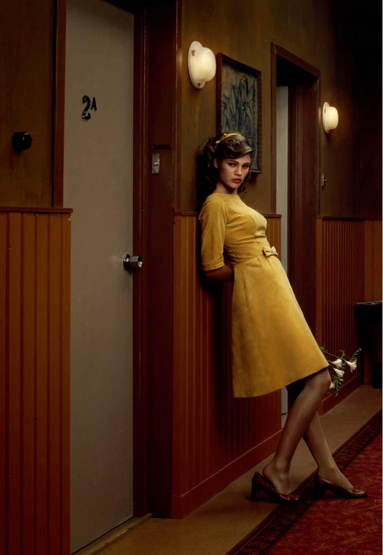
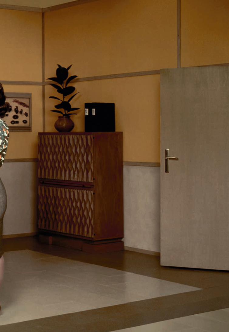
uit het raam aan het zicht onttrokken door gordijnen en overbelichting, wat de suggestie wekt dat daarbuiten, net buiten bereik, een keurig onderhouden buitenwijk ligt. Ook andere onderdelen van zijn decors werken goed als kaders. De boksring in Hope, de bedden in Hotel, het Stadtbad Neukölln in Berlin, het zijn allemaal gekaderde beelden die een bepaald drama suggereren: overspel, geweld en lichamelijkheid. Je ziet het drama niet, maar in de scène zitten aanwijzingen dat het wel bestaat.
Schitterende maskers
Dat die negentiende-eeuwse ideeën – over eclecticisme, bekleidung en kaders – zo fraai weerklinken in het werk van Olaf is opvallend. Want juist nu lijken we steeds meer behoefte te hebben aan historische stijlen en is mixen-en-matchen de norm: retro mode, kostuumdrama’s, antiek op vlooienmarkten... Ook online, voorbij de wereld van styling en mode, omhullen we ons met meerdere lagen. We hebben virtuele avatars en passen die aan de omstandigheden aan, voor als we aan het netwerken, daten, zakendoen of
onder vrienden zijn. We brengen onze levens ook online in beeld, ver weg van de huiselijke sfeer. We kaderen al onze levenservaringen in, aan de hand van zorgvuldig geselecteerde foto’s van vakanties, pasgeboren baby’s en speciale gelegenheden: het leven vervat in een serie hoogtepunten. Olaf zegt dat de werkelijkheid zijn interesse niet heeft… Misschien omdat er maar zo weinig echte werkelijkheid is. Iedere werkelijkheid is gekleurd: verscholen achter een instagram filter of een masker.
Wie moeite heeft met de vervagende grenzen tussen realiteit en verwijzingen naar de realiteit, kan voor advies terecht bij Semper. Hij weet hoe je om moet gaan met deze hedendaagse problematiek: ‘Een masker heeft geen zin,’ waarschuwt hij, ‘als wat achter het masker zit onecht is of als het masker niet deugt.’ Dat betekent dat we twee dingen kunnen doen. Ofwel we blijven goede structuren maken ‘dat wat achter het masker zit’. Maar in een tijd waarin men zegt dat alles al een keer gebouwd is, is de andere optie misschien wel beter: schitterende maskers maken.
Oktober 2013
12
DuskThe Mother2009
12 13
14
14 15
16
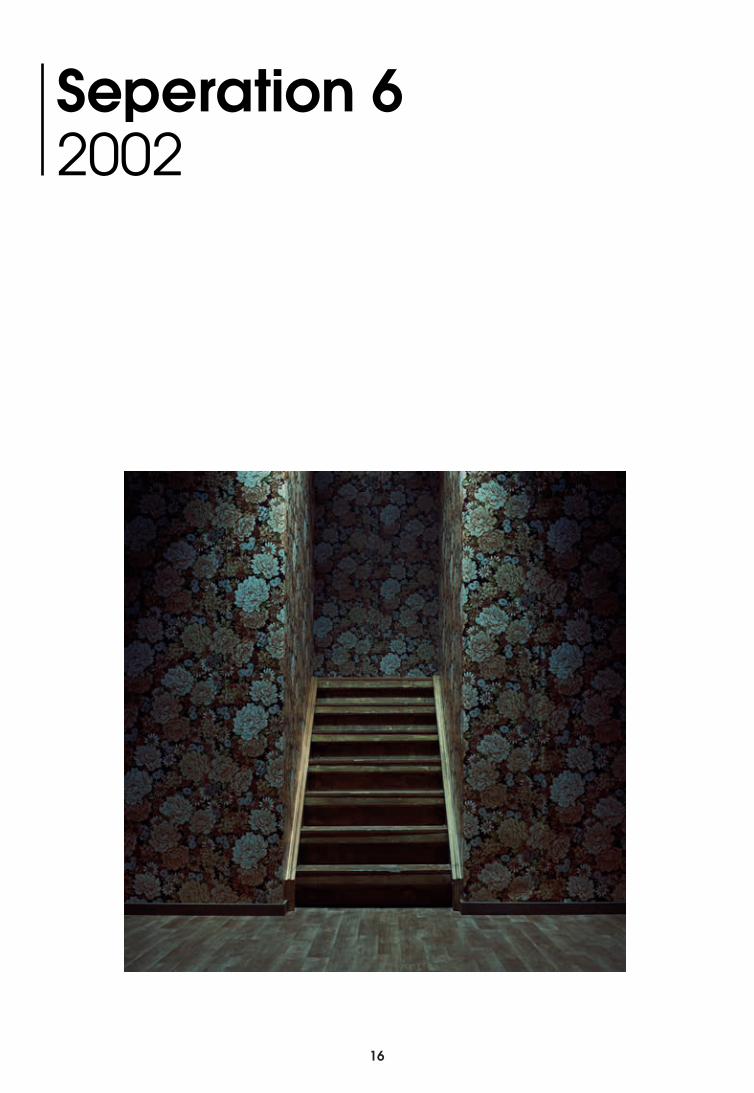
Seperation 62002
16 17
18
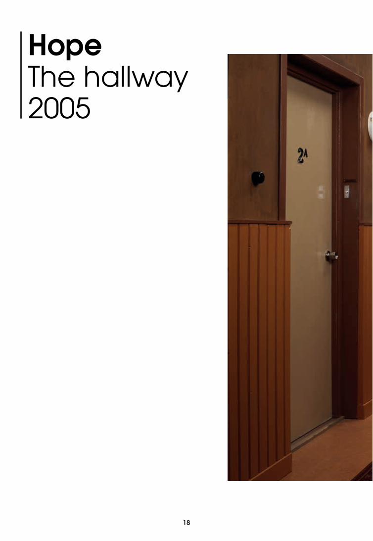
HopeThe hallway2005
18 19
20
20 21
22
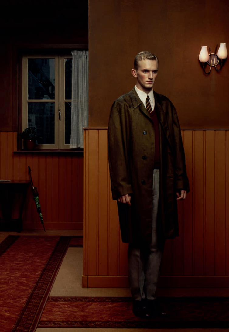
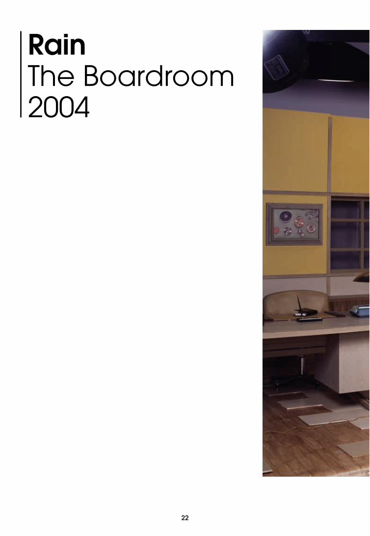
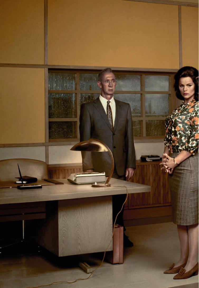
Rain The Boardroom2004
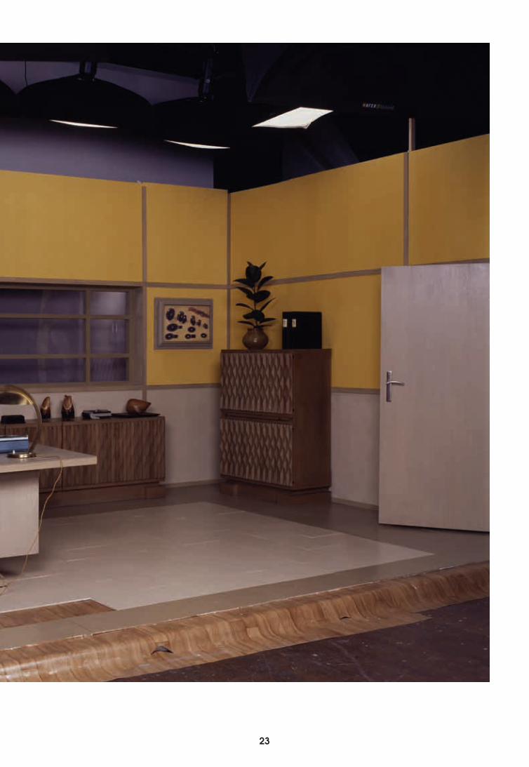
22 23
24
24 25
26
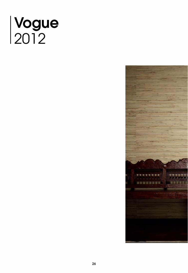
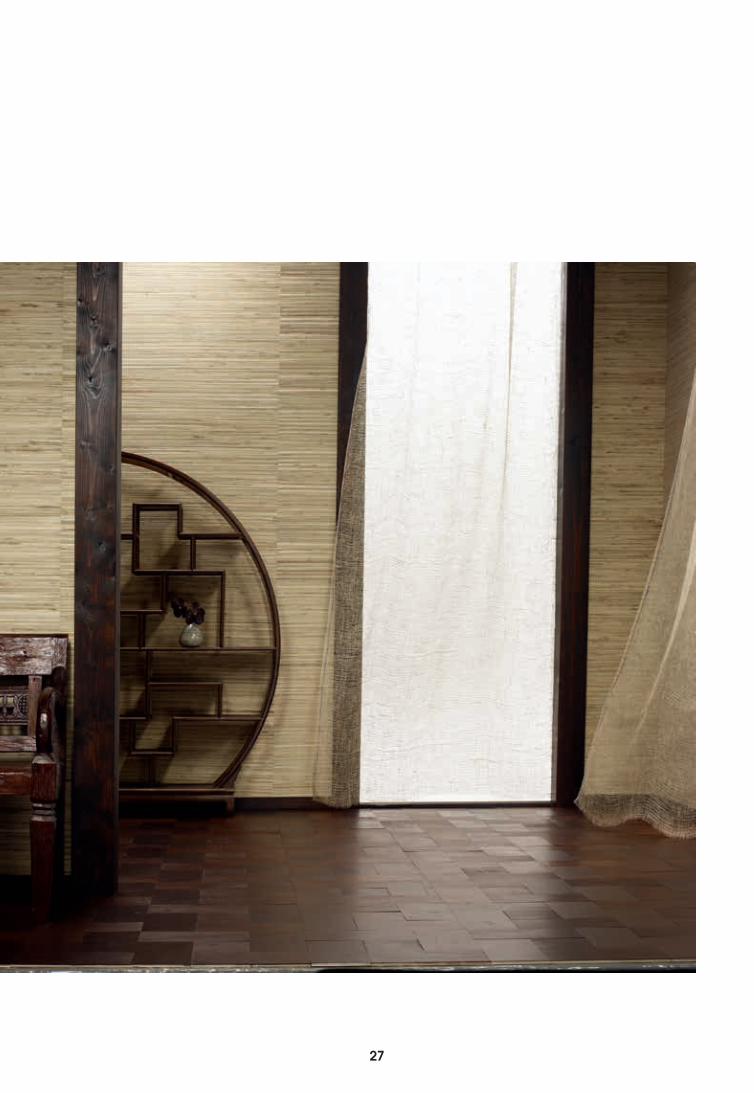
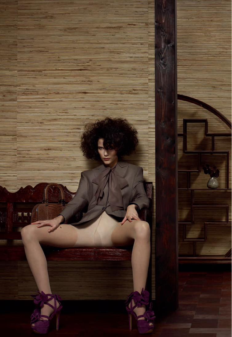
Vogue 2012
26 27
28
28 29
30
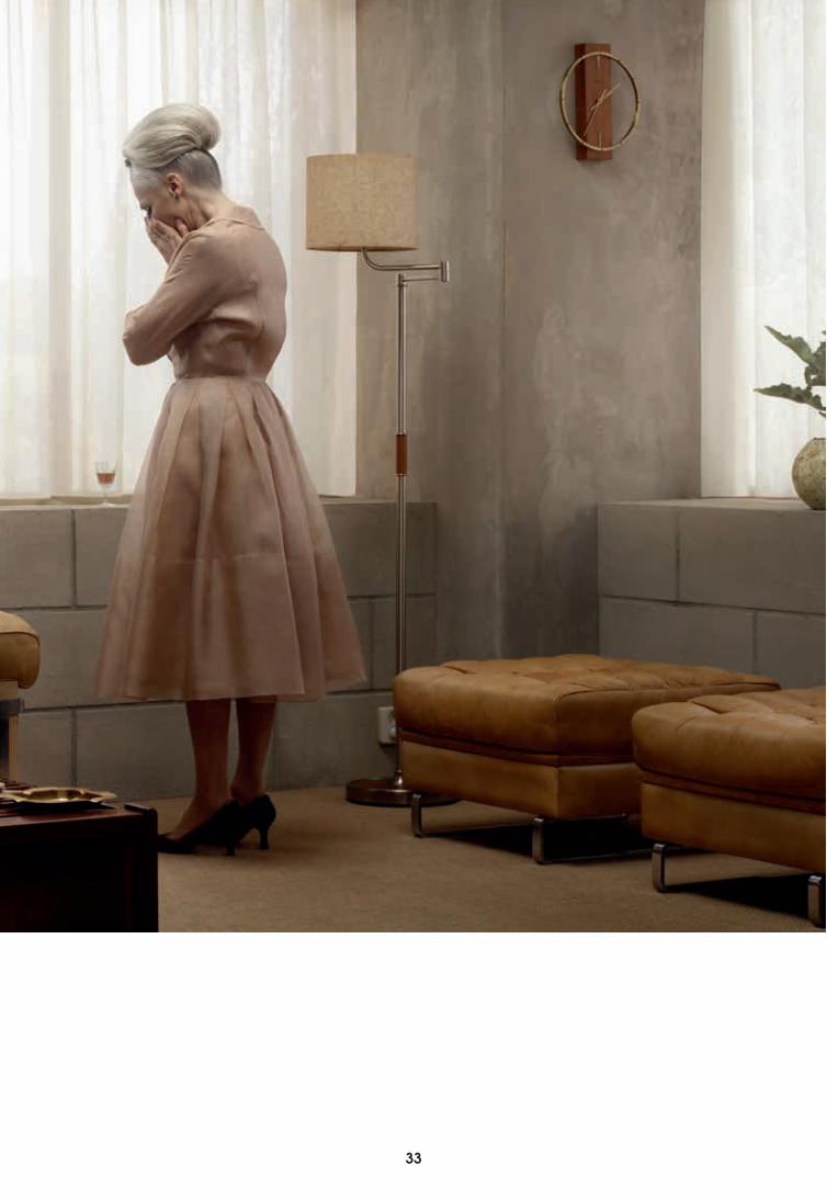
Grief Grace 2007
30 31
32
32 33
34
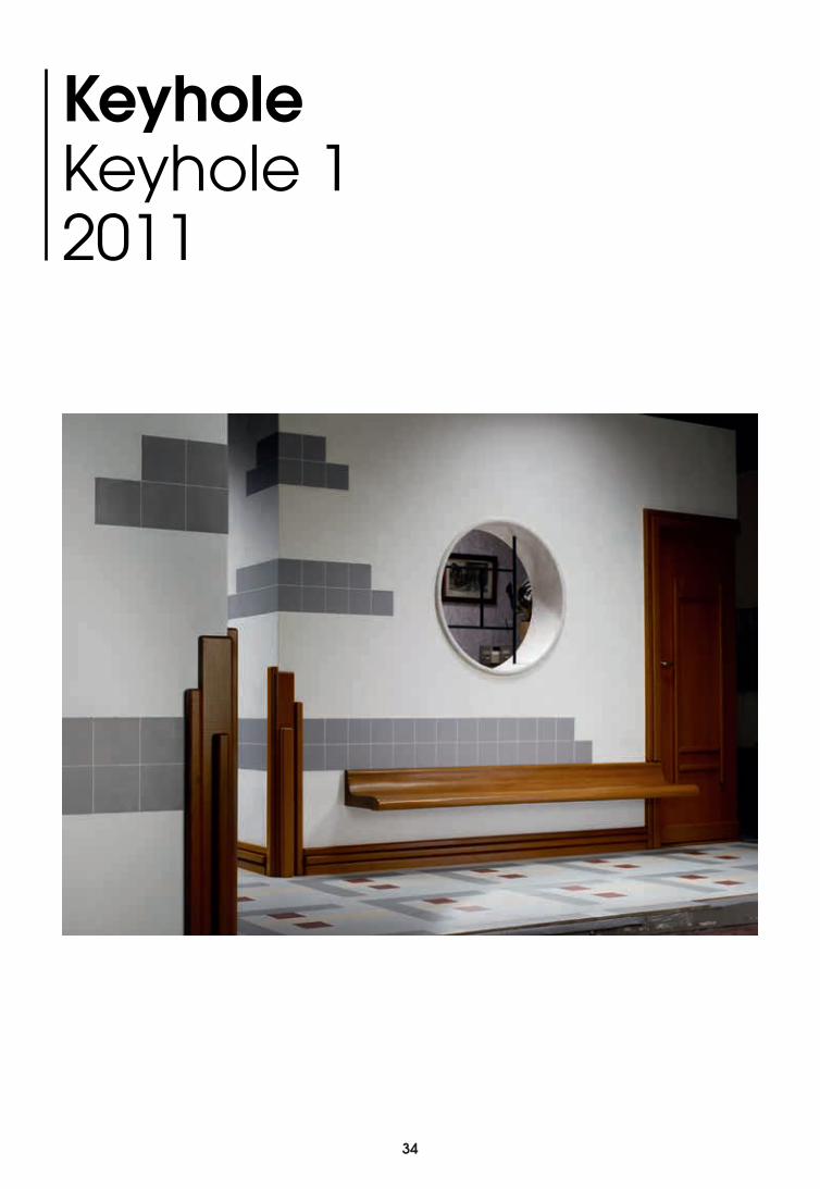
KeyholeKeyhole 12011
34 35
36
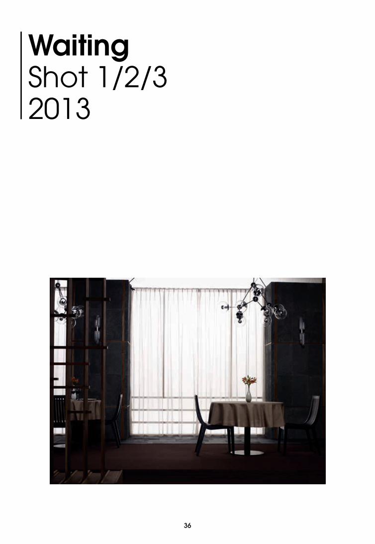
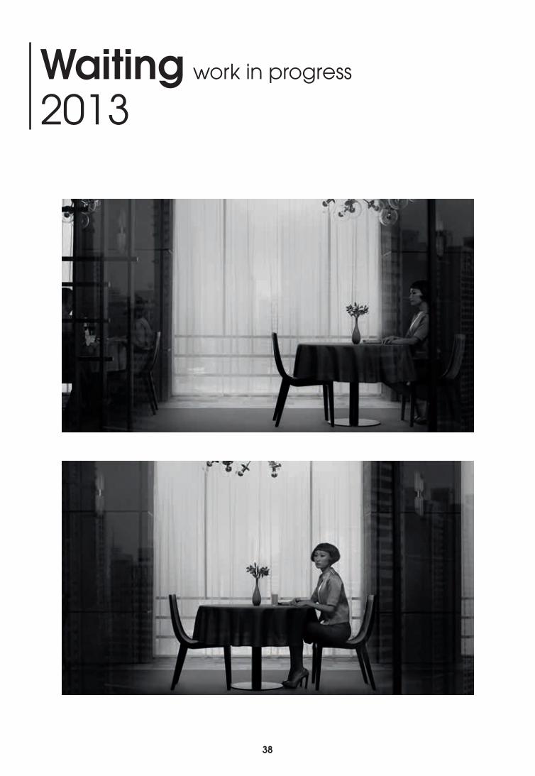
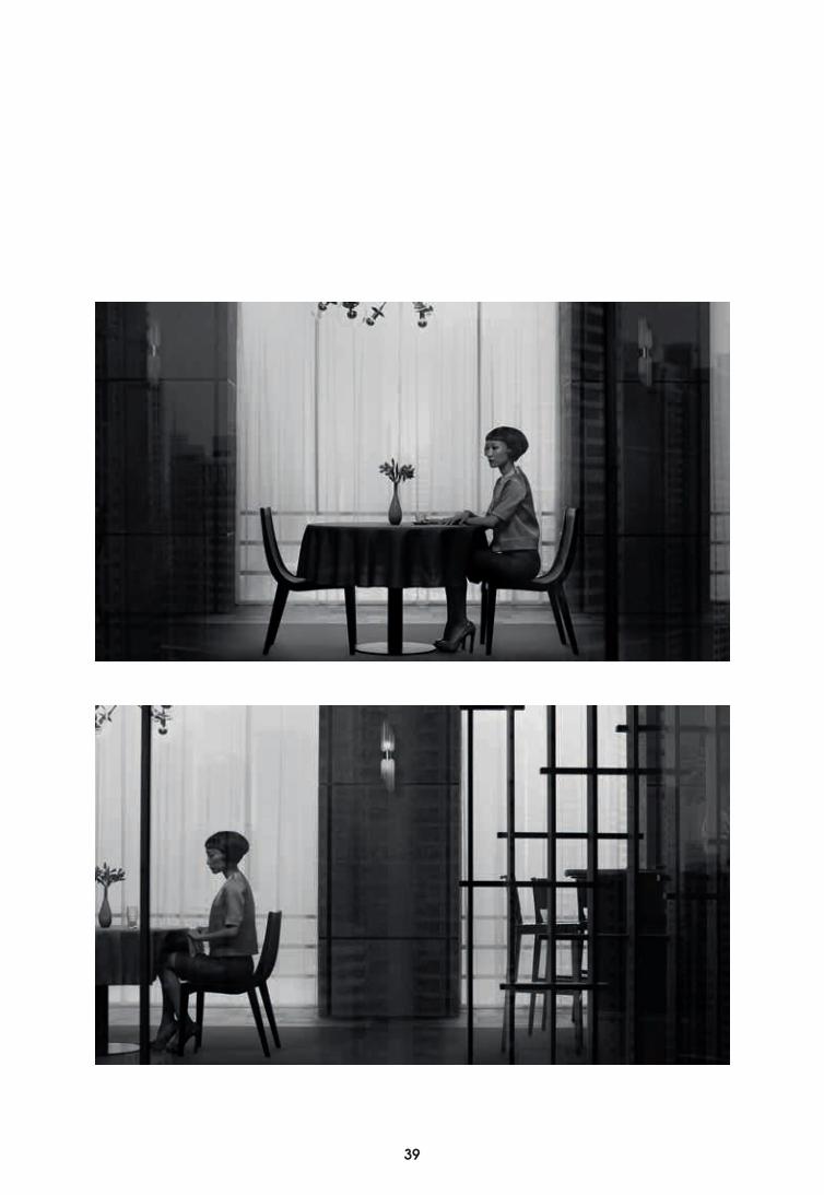
WaitingShot 1/2/32013
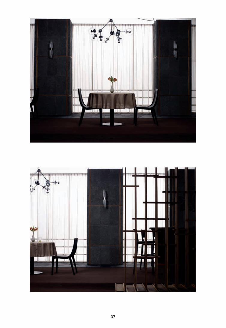
36 37
38
Waiting work in progress
2013
38 39
40
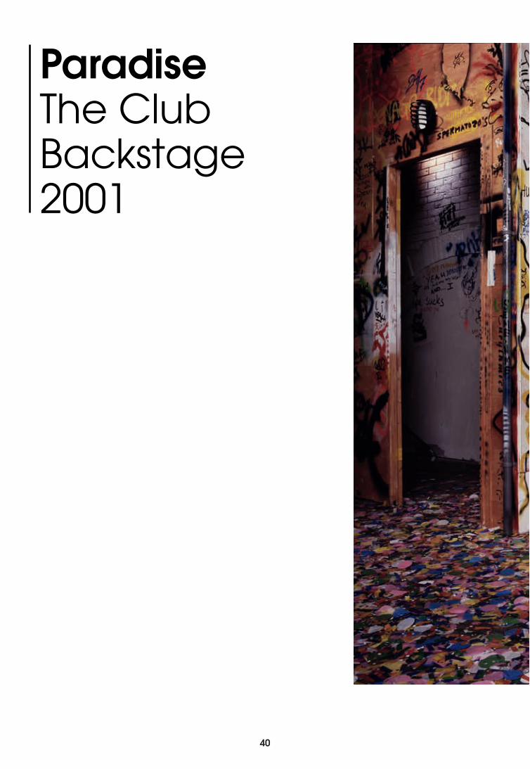
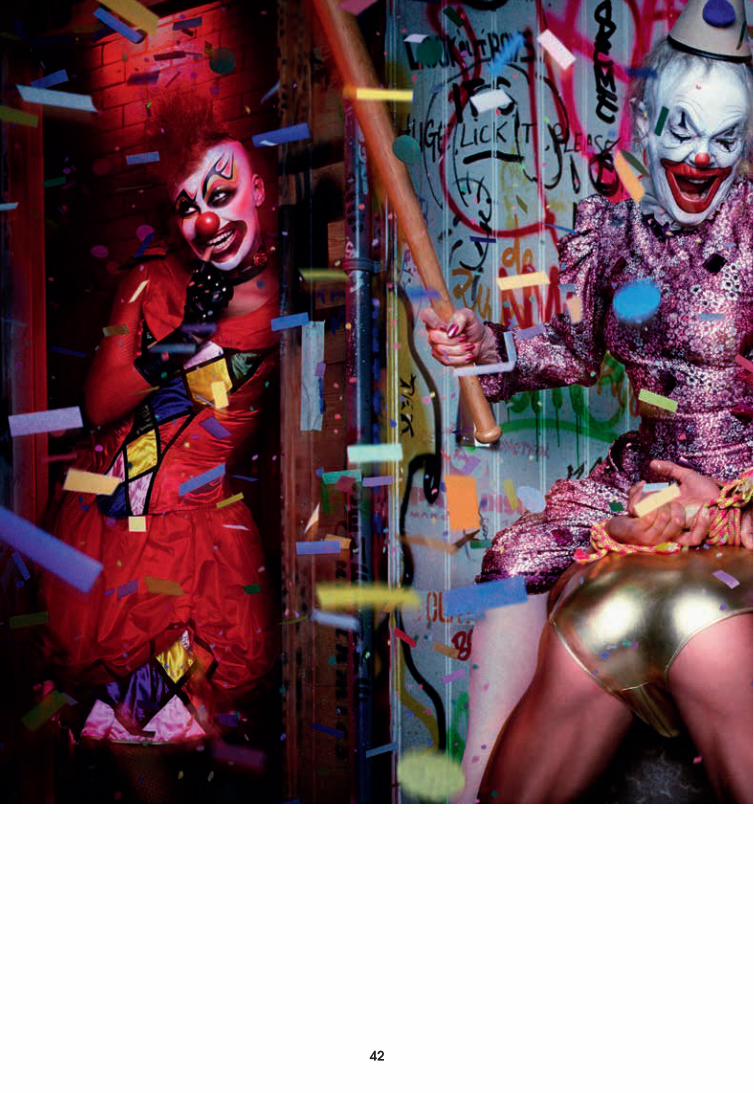
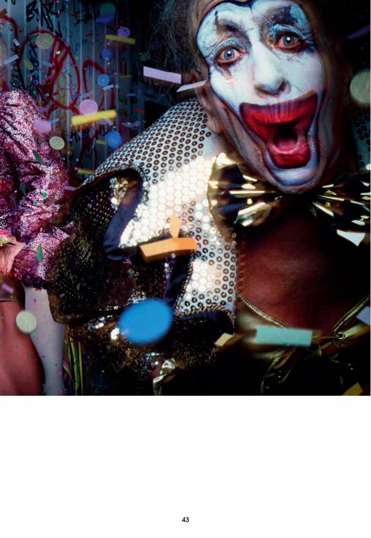
Paradise The Club Backstage2001
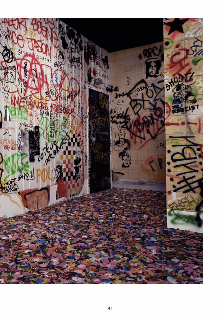
40 41
42
42 43
44
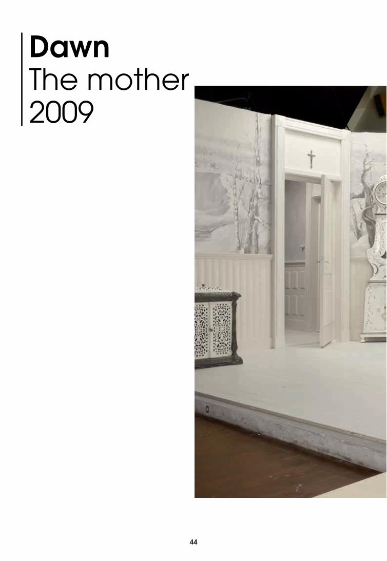
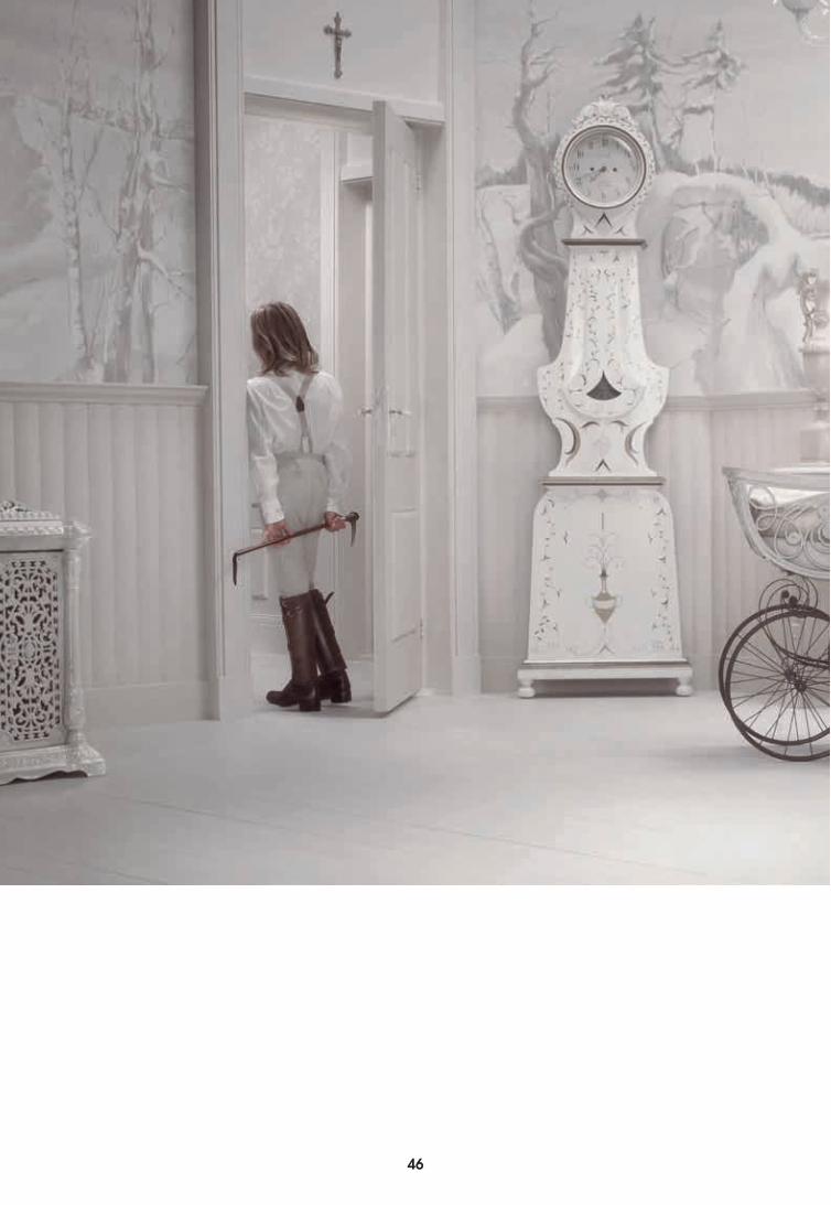
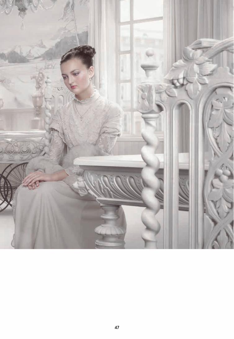
Dawn The mother 2009
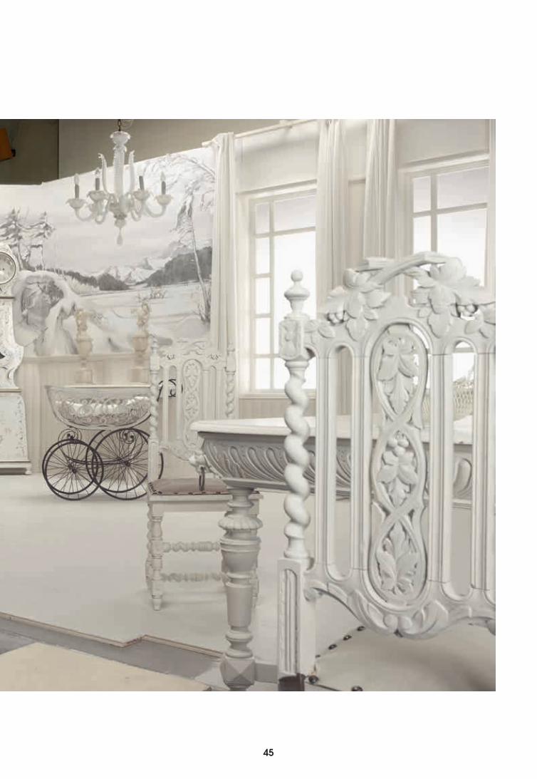
44 45
46
46 47
48
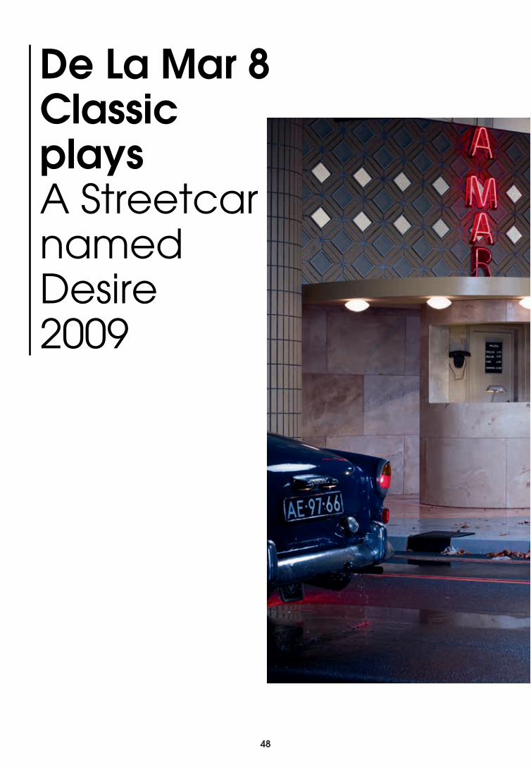
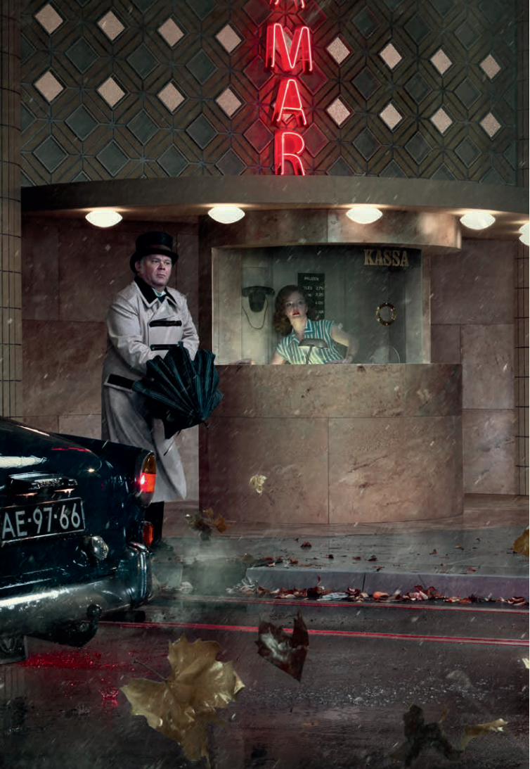
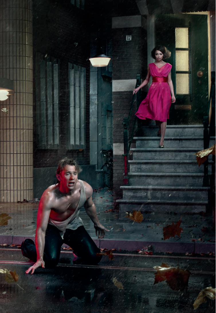
De La Mar 8 Classic playsA Streetcar named Desire 2009
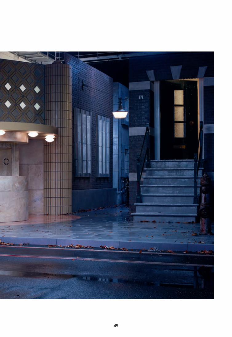
48 49
De La Mar 8 Classic playsA Streetcar named Desire 2009
50
50 51
52
Beginnings are by definition hopeful; anything seems possible when we are energised by curiosity and protected by a lack of knowledge. This book represents such a beginning. Published to accompany the exhibitions 1:1 Sets for Erwin Olaf and Bekleidung, it marks the hope-filled start of the multiyear Interior & Landscape research programme at Het Nieuwe Instituut. The programme approaches the Landscape and Interior not exclusively as an architectural terrain but also as the point of intersection between the three disciplines Het Nieuwe Instituut represents: architecture, design and e-culture. This book first of all features the photography of Erwin Olaf, including many well-known images. Alongside these are previously unpublished shots of sets Olaf has used in his work, absent their models and narratives. Designed by Floris Vos, the sets provide surprising insight into how Olaf’s oeuvre has come about. They have also inspired the essay by Brendan Cormier that is included here. In it, Cormier traces links between Olaf’s oeuvre, Vos’s sets and the exhibition Bekleidung curated by Erich Weiss, in which wallpaper is treated as a site for meaning by Dutch and foreign artists including Damien Hirst, Sylvie Fleurie and Willem Oorebeek. Cormier outlines the historical concept of Bekleidung – a wall’s dressing as opposed to its structure – and looks at the forces that exert an influence on the interior and cause a continual redefinition of its boundaries. In the coming years, Het Nieuwe Instituut will explore those boundaries in order to stimulate discussion of the changing function and meaning of the interior and highlight various other shifts, including that taking place in the relationship between architecture, design and e-culture.
We hope you will follow our investigations in the Landscape and Interior programme, now and far into the future!
November 2013Het Nieuwe Instituut
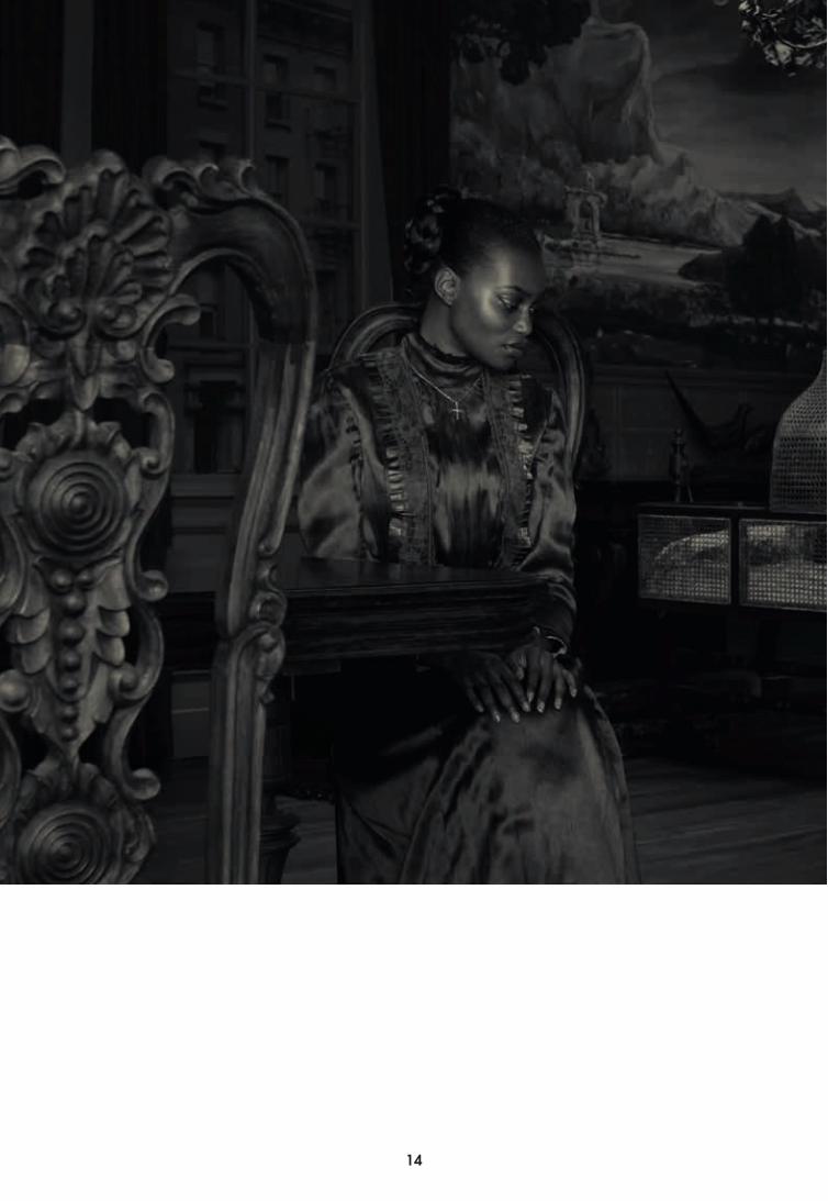
In the documentary, On Beauty and Fall, celebrated Dutch artist Erwin Olaf states that he has no interest in reality. He laments the art world’s exaltation of the documentary photographer, who moves the viewer with earnest depictions of the ‘real world’, which in the end are often conceits of their own. Instead Olaf’s real world is his interior world, the world of his own fantasies. Loaded with ambiguous meaning, it’s a world where wallpaper drips with pathos, and curtains veil an exterior we’ll never encounter. Models reveal ambivalent expressions and all objects sit complicit in the montage: a carefully positioned phone is charged with anticipation of a call that never takes place.
Embedded in these images is a story about design, a story of theatricality and the idea of a constructed interior, for in these interiors representation blurs with reality. Perhaps unwittingly, Olaf resurrects the nineteenth century notion that architectural space should display and amplify the drama of life. In so doing his photographs suggest tools for design – the careful montage of stylistic references, expressive skins, and selective framing – that have been used in the past, and might be resurrected once again.
In Which Style Should We Photograph?
Style is a word inseparable from Olaf’s images. His work is characterized by the variety of historic styles that comprise his sets – from the Norman Rockwell optimism of 1950s America [Rain], to a somber post-JFK 1960s [Grief], to the interbellum years of Germany [Berlin], to the ravages of war in sixteenth century Holland [The Siege and Relief of Leiden]. The ease with which Olaf and his set designer Floris Vos move through these styles recalls the practice of the nineteenth century architect, who, driven by the historicism and eclecticism of the time, was expected to recreate any number of styles – from Greek, to Roman, to Gothic, and so on – at the whim of his patron. This seemingly rudderless approach to aesthetics prompted Heinrich Hübsch in 1828 to ask the question: ‘In which style should we build? – a debate that would endure the century, with various architects advocating for one style over another. Gradually architecture would resolve this tension by muting and abstracting historic elements altogether, paving the way for the unadorned facades of twentieth century modernism.
In early defiance to this tendency, the nineteenth century Prussian architect Karl Friedrich Schinkel believed in the expressive force of the building through the use of theatricality and historical reference. Drawing from his experience as a set designer, painter, and creator of panoramas and dioramas, Schinkel employed historical motifs primarily to evoke feelings in the viewer. For example, in the design of the Neue Wache, a military guardhouse for King Friedrich Wilhelm III, he amplifies the monumentality of the modest site by making reference to the Roman castrum and the Doric portico, unashamedly combining the language of Greek and Roman architecture, to suggest military might. In his Altes Museum, he inserts a centrally located rotunda in deference to the Pantheon in Rome, but also, as Anthony Vidler puts it: “[as an] emblem […] of the suprahistorical nature of aesthetic quality, a reminder of the nature of ‘art’ in the historical work of art.”Similarly, Olaf’s interiors aren’t employed as historical reenactments as such, but employ historic styles to evoke an idea or a feeling. Style is an expression, a mood-setter, and a signifier. For example, in Grief, each element in the set and each color, acts as a reference that contributes to the melancholy of the title: The vertical lines made by the shadows of the drapes mimic the bars of a jail; juxtaposed with the optimism of the sleek modernist furnishing, referring to the resurgent postwar middle class. Meanwhile the Jackie Onassis haircuts and outfits recall the tragedy of the JFK assassination and the collective feeling of loss that the nation experienced. The montage of contradicting moods triggered by these signifiers creates a tension that forms the drama of each piece.
Skins without Structure
The expressive force of skins – the wallpaper, the curtains, the dresses – brings to mind another nineteenth century concept: Gottfried Semper’s notion of Bekleidung or cladding. Semper distinguished separate meanings from the two German words for wall: the structure (Mauer), which is normally concealed, and the cladding (Gewand) or visible covering of the wall. This second function of the wall, as cladding or Bekleidung, as Semper put it, was an important tool for expression in architecture, that he felt should be exploited. Comparing cladding to clothing in human evolution, Semper believed that the naked were clothed for protection or out of shame, and so too were sacred objects and spaces covered or enclosed to protect them from unauthorized view. For Semper, architecture’s job was to express culture and society in spatial form; Bekleidung was a way to mediate this – using color, ornamentation, patterns, and painting. He also saw the potential synergy of relating cladding to other cultural products, such as textiles and
GOING FROM HEREGuus Beumer
NO INTEREST IN REALITY: Erwin Olaf and the Constructed InteriorBrendan Cormier
52 53
ceramics. Adolf Loos would impart more historical impact to the term, by suggesting that Bekleidung predated structure altogether, as nomadic tribes used textiles and animal skins to erect tents for shelter. Before structure, architecture was skin.
Modern architecture in the twentieth century would eventually reject the notion of Bekleidung, rallying against Semper to promote the expression of pure structure and clean surfaces. According to modernists ornamentation was a distraction from seeing the true nature of the object. Loos would even compare ornamentation to degenerate and primitive behavior, and Le Corbusier would famously advocate for a coat of whitewash on every wall. The development was considered a march of progress towards an objectively and universally more sophisticated architecture and future. A critical flaw in their argument however was that it ignored the idea that whitewash itself conveyed cultural meaning. It was indeed a form of expression, no less than ornamentation itself, and thus a form of Bekleidung.
Meanwhile, in the popular homes of America, ornamentation and cladding would thrive with the proliferation of decorative wallpapers, housewares, and home furnishings throughout the twentieth century. The flimsy stick-frame homes that would spread across the American suburbs had very little structure worthy of display, and so an industry of home decoration bourgeoned to cover every surface. Lifestyle magazines and television would become powerful purveyors of taste, instructing a consumer society on how to live and what to buy. Arguably these furnishings and decorations – a commercialized Bekleidung – tell a stronger story about the nature of a society than the exceptional architecture of the time. By viewing the popular interior we can read the zeitgeist of an era, the desire for objects and status symbols of a certain design. Perhaps then it is no surprise that Olaf focuses his lens on these more popular images of consumer taste – for as consumers ourselves, we can easily read the historical signifiers and draw interpretations.
Returning to Olaf’s sets, it is curious to note they are all cladding and no structure, which, in a funny way, brings them closer to the nomadic origin of architecture, as Loos had conceived. That his sets can be picked up and moved from his studio to an exhibition reinforces such a notion. Indeed it is a testament to the power of Semperian cladding that these photographs can still resonate, despite having no underlying structure at all.
Life On Display
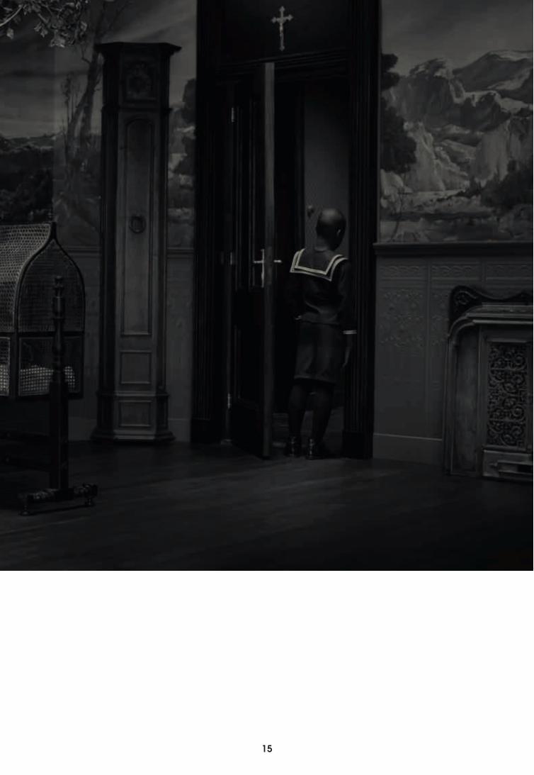
To view an Olaf photograph is also to enter into a world of multiple frames that
guide our gaze and that of the actors. It is a reminder of how our interior spaces are constructed as such, full of gaze-directing cues. Your gaze falls upon a framed space often so intimate you feel as a voyeur. The actors in the scenario are also aware of the frames – the window looking out on the yard, the spotlighted furniture arrangement, the perfect table setting, or the camera lens staring right back at you. Works like Keyhole, are explicit in this voyeurism; with the actor’s back turned, you are free to stare without shame, but the framing is tight (as if through a keyhole) and the gaze is limited. In wider shots, such as in Hope, you are confronted with the model’s gaze, and made uncomfortable by the muted anticipation in their eyes.Such notions of framing can also be drawn back to the nineteenth century in the works of Semper and Schinkel. They shared a common view that architecture is a frame that should accommodate human experience. Drawing from Schinkel’s experience with stage design, the frame was intended to catch the eye of the viewer and direct their attention to the drama of life. This was used to great effect in Schinkel’s paintings, especially to highlight the transition between the interior world and the outdoors. In these paintings the colonnade often serves as a frame through which the viewer’s gaze must pass to reach the landscape, moving from a closed space bounded by opaque materiality, into a space of daylight and distance. Unsurprisingly, the colonnade would later be used to great effect in his architecture. For instance in the Altes Museum, he covers the façade with a wide colonnade framing views out to the Lustgarten and the monumental buildings beyond. In the museum’s rotunda multiple frames are at play vying for your attention: the columns frame each statue, while an oculus plays a double role, framing a circular image of the sky, and directing your attention to the center with a casted beam of light.
Olaf is equally clever in manipulating the architecture of his sets to simulate frames. In his Grief series, he uses the window’s view to the outdoors, obscured by curtains and overexposed light, to suggest a well-manicured suburban setting vaguely beyond reach. Other spaces within the set serve equally well as frames, the boxing ring in Hope, the beds in Hotel, the Stadtbad Neukölln in Berlin, each frame charged with the suggestion of a different drama of life; illicit affairs, competitive violence, and the refinement of the body. We don’t see the drama play out, but we are introduced to the scene and offered traces of its existence.
Exquisite Masks
There is something incredibly resonant about Olaf’s work and these nineteenth century notions today – notions of eclecticism
of styles, expressive skins, and selective framing. For it seems to be an increasingly contemporary condition to crave the consumption of historic styles and mix and match as we please, from retro fashions, to period dramas, to antiquing at the flea market. We clad ourselves in multiple skins beyond the wallpaper and off-the-rack outfits, to the online world of virtual avatars; and modify each avatar depending on the purpose and the site: one for networking, one for friends, one for dating, one for affairs. How we frame our lives has also moved online, away from the mere framing of our household spaces. Instead we frame our entire life experience through selectively curated photos of vacations, newborn babies, and special events; a highlight reel of our life. When Olaf says that that he doesn’t care for reality, perhaps it’s because there’s very little reality to find. Everything is rendered through an instagram filter; everyone is wearing a mask.
In struggling with this blurring of representation and reality we can once again return to Semper to offer us advice in dealing with this modern condition: “Masking does not help” he warns “when behind the mask the thing is false or the mask is no good.” This suggests a two-fold agenda for the future. The first is to continue making good structures, the things behind the mask. But in an era where there is allegedly nothing left to build the second agenda is perhaps more important: and that is to produce exquisite masks.
October 2013
54
Essay caption 1: The Neue Wache, borrowing historic references of the Doric portico and Roman castrum to express notions of empire and military might. Engraving. Designed by Karl Friedrich Schinkel, engraved by Johan Conrad Susemihl. 18192: The Rotunda in the Altes Museum and its multiple frames.Perspective engraving, drawn and engraved by Karl Friedrich Schinkel3: The gallery of the Altes Museum with its framed view to the Lustgarten and surrounding monuments. Pen and black ink and pencil, designed and drawn by Karl Friedrich Schinkel. 1829.
ColofonEssay: Brendan CormierVertaling: Anna Roelofsz en Christy de BackFotografie: Erwin OlafOntwerp en inrichting sets: Floris VosGallerie: Flatland GalleryDecorbouwers: Elmer Jacobs, Dennis Los, Kees Bierma, Albert Kuipers, David PetersMenno VerduinDecorateurs: Erik Peters, Bas Peeperkoorn, Ernst Paradies, Coby ReesGrafisch ontwerp: Ben Laloua/Didier Pascal Art director: Maureen MoorenDrukwerk: robstolk®
Met dank aan: Erich Weiss curator Bekleidung, Studio Erwin Olaf www.erwinolaf.com, Management Erwin Olaf Shirley den Hartog, Fabriek NL, Hollandse Handen, Christiaan Dinnessen
Projectteam Het Nieuwe InstituutFloor van Ast, Tosja Backer, Marten Kuijpers,Willemijn Thissen
Het Nieuwe InstituutMuseumpark 253015 CB Rotterdam
Postbus/PO Box 2373000 AE RotterdamThe Netherlands+31 (0)10 [email protected]
AcknowledgmentsEssay: Brendan CormierTranslation: Anna Roelofsz en Christy de BackPhotography: Erwin OlafDesign and decor sets: Floris VosGallery: Flatland GalleryDecor builders: Elmer Jacobs, Dennis Los, Kees Bierma, Albert Kuipers, David PetersMenno VerduinDecorators: Erik Peters, Bas PeeperkoornErnst Paradies, Coby ReesGraphic design: Ben Laloua/Didier Pascal Art director: Maureen MoorenPrint: robstolk®
With specials thanks to: Erich Weiss curator Bekleidung ,Studio Erwin Olaf www.erwinolaf.com, Management Erwin Olaf Shirley den Hartog, Fabriek NL, Hollandse Handen, Christiaan Dinnessen
Projectteam Het Nieuwe InstituutFloor van Ast, Tosja Backer, Marten Kuijpers,Willemijn Thissen

54